Most has enough of everything! We focused on the current face of the city and its peculiar mood. We designed a brutalist headline font “Dost Sans” for the city and a system of graphic horizons that can easily adapt to a specific medium. The chosen colour scheme reflects both the historically experienced blue… Read More
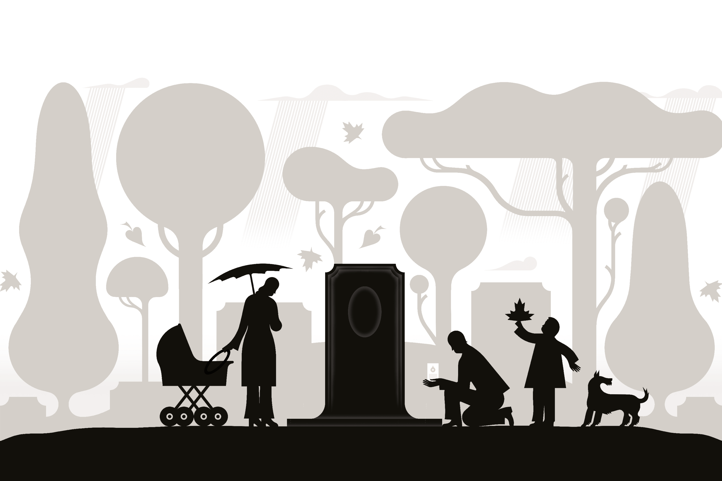
Winner of the competition for the visual style of Prague cemeteries and funeral services. After removing the horizontal partition, the “H” symbol opens the gate and lets life into the cemetery grounds. The negative space in the mass of the letter refers to the significant architecture of chapels, tombs and… Read More
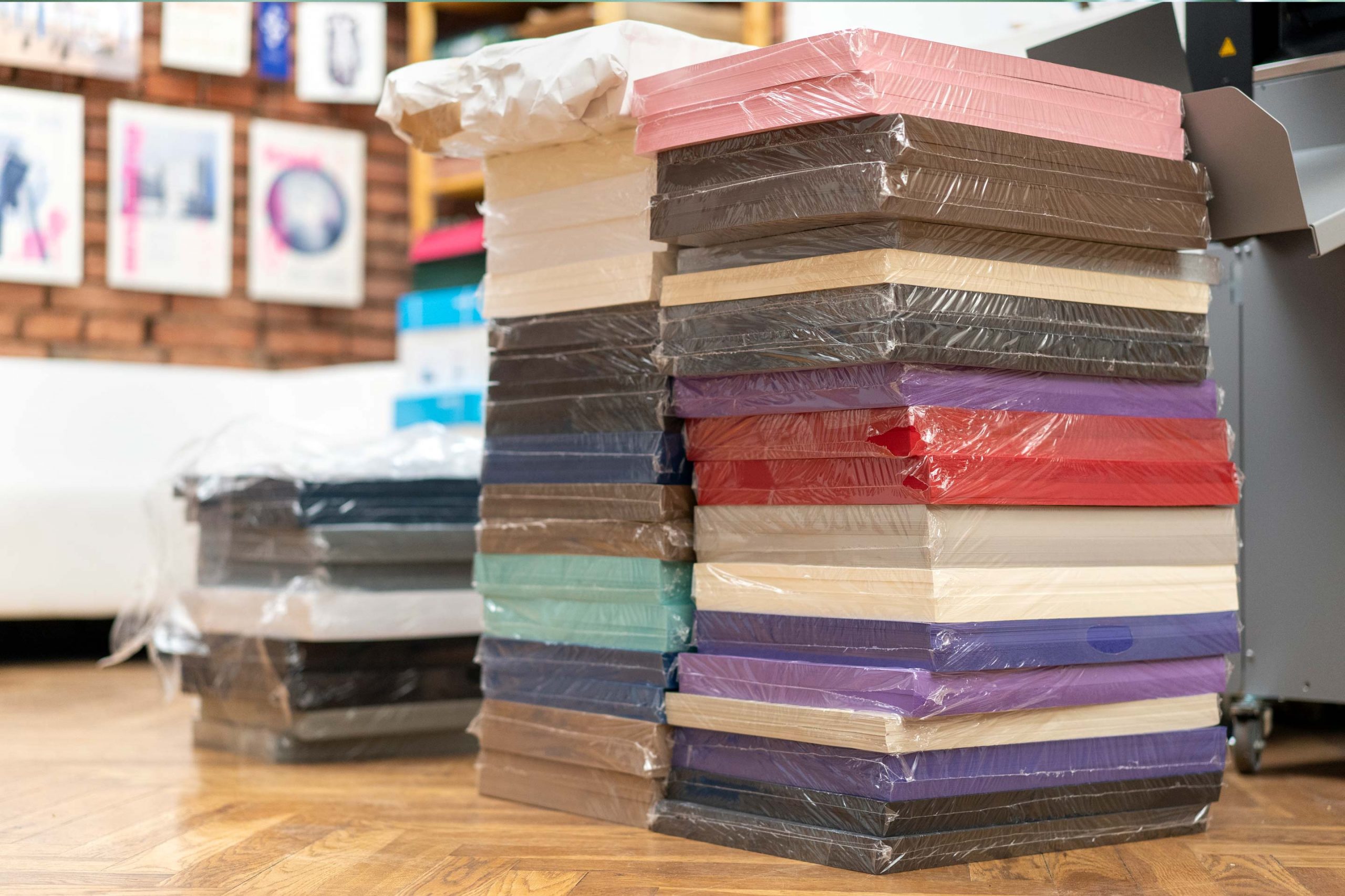
We have designed them a unique swatch book featuring dozens of beautiful papers and their refinement possibilities. The connecting theme is a series of audiocassettes that we had laser cut, engraved, hot foil stamped or partially varnished. Read More
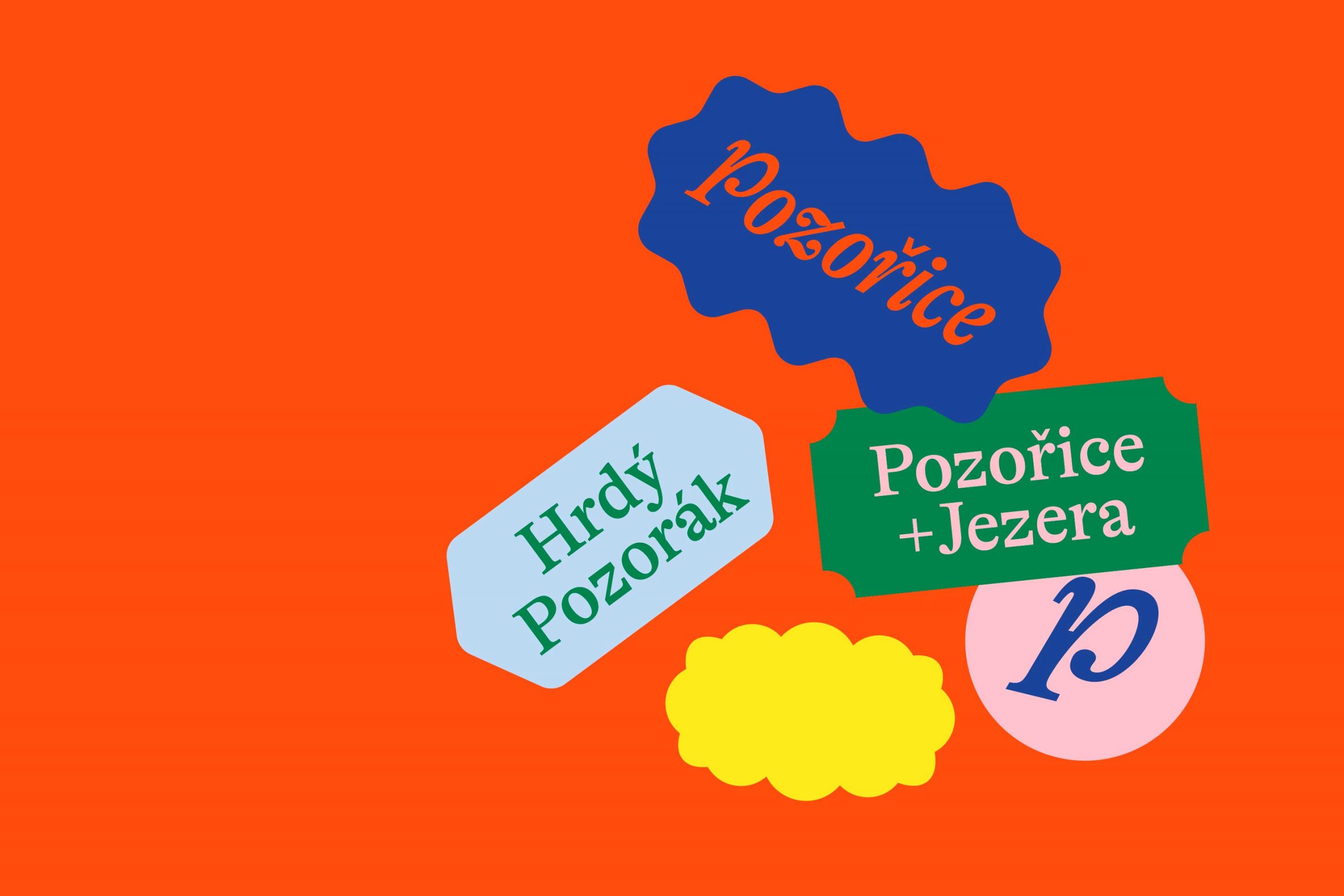
Winner of the competition for the visual identity of the South Moravian town of Pozořice. The deliberately colourful and playful mosaic of labels corresponds to the local nature. The texture colour scheme is inspired by the traditional costumes of Petra and is completely flexible — it can be enlarged, recoloured… Read More
Winner of the competition for the visual identity of the South Moravian town of Pozořice. The deliberately colourful and playful mosaic of labels corresponds to the local nature. The texture colour scheme is inspired by the local traditional costumes and is completely flexible — it can be enlarged or recoloured… Read More
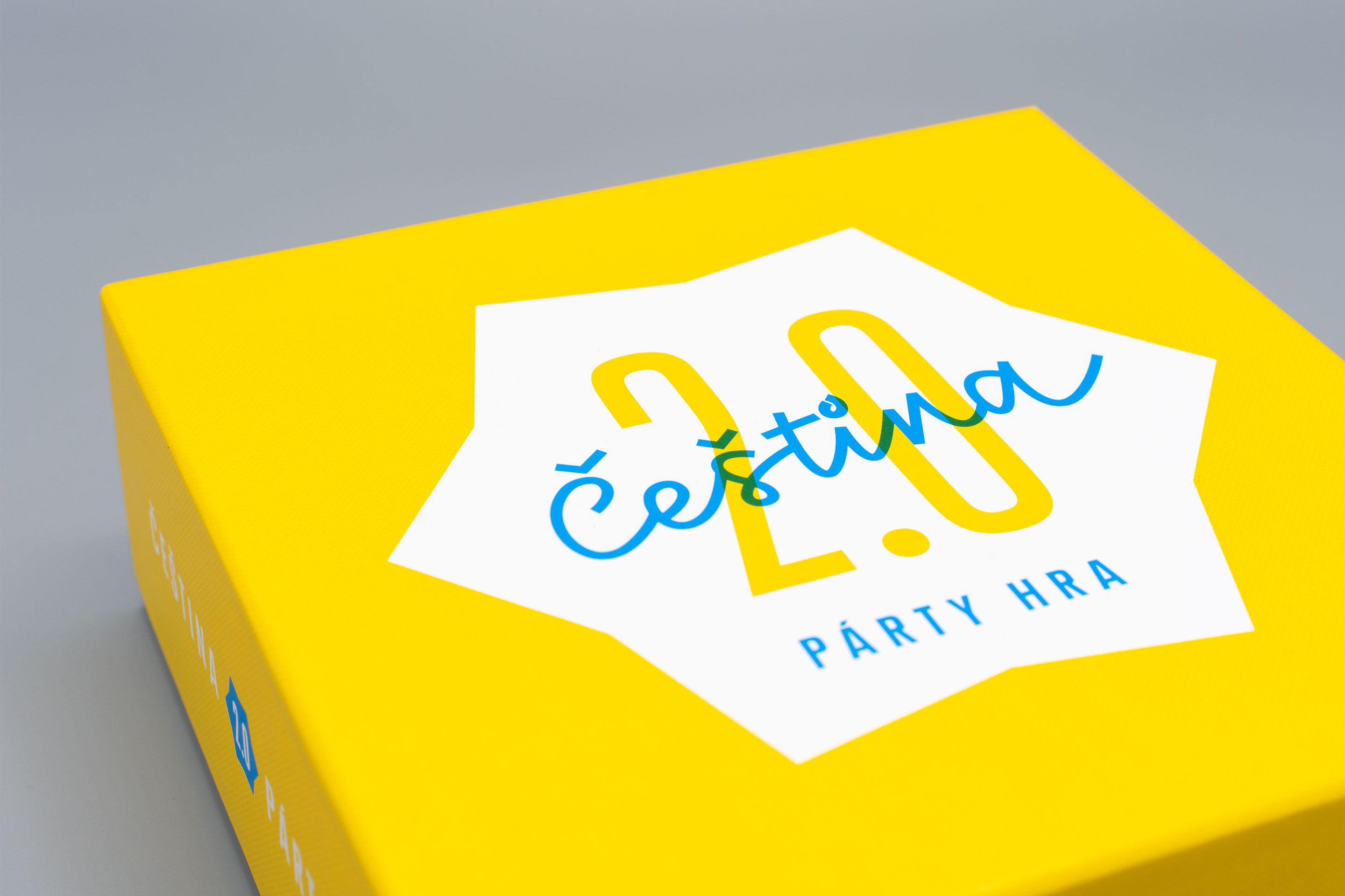
The new party game Czech 2.0, which we had the honour to graphically dress up, has the answer to lot of tricky linguistic questions. The illustrations were done by Lukáš Fibrich. Read More
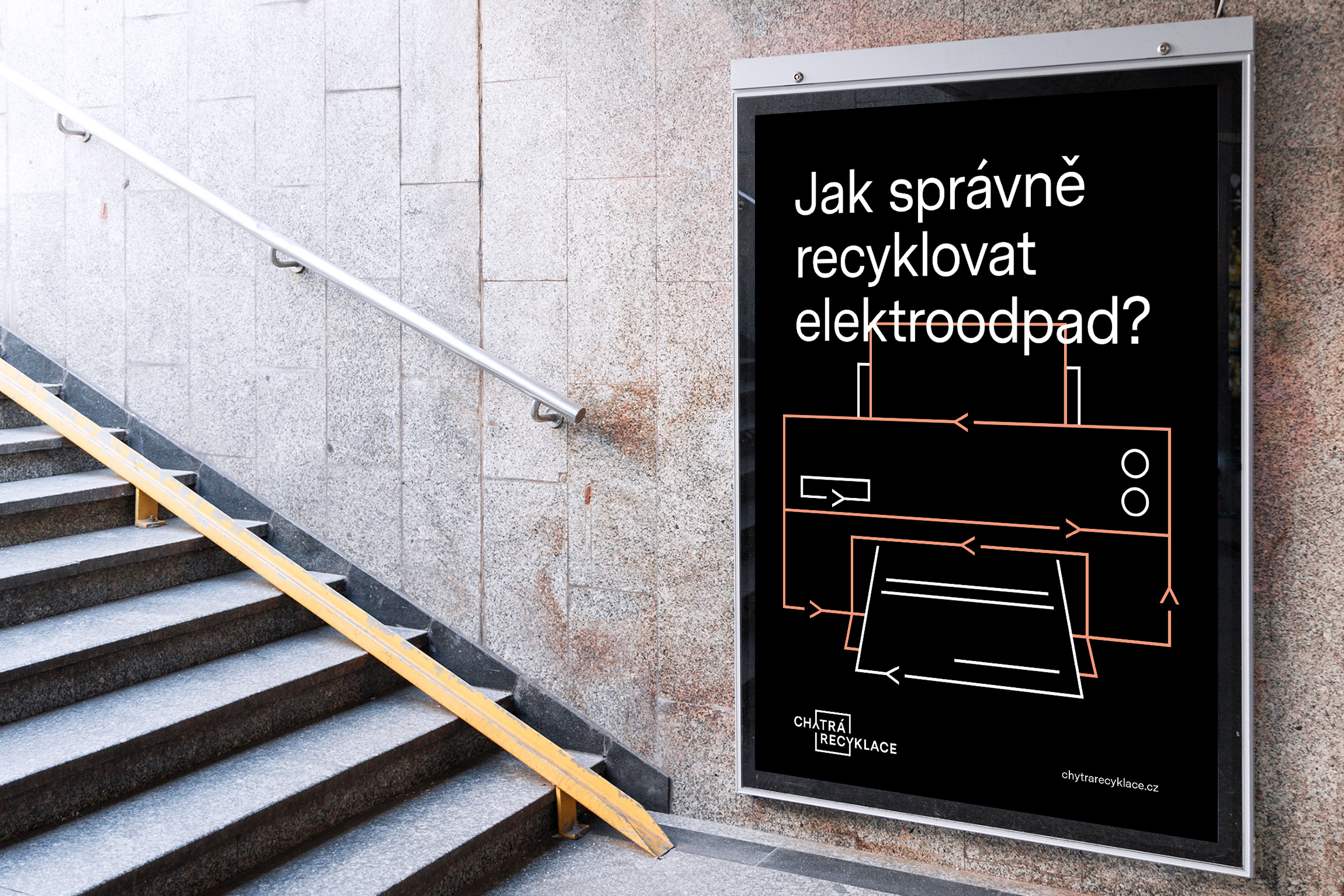
E-waste is a reservoir of valuable raw materials. We have created a logo and identity for the Smart Recycling project, which helps raise awareness about the environmentally friendly disposal of end-of-life appliances. The contours of the objects circulate in closed cycles and are a characteristic element of the graphic applications. Read More
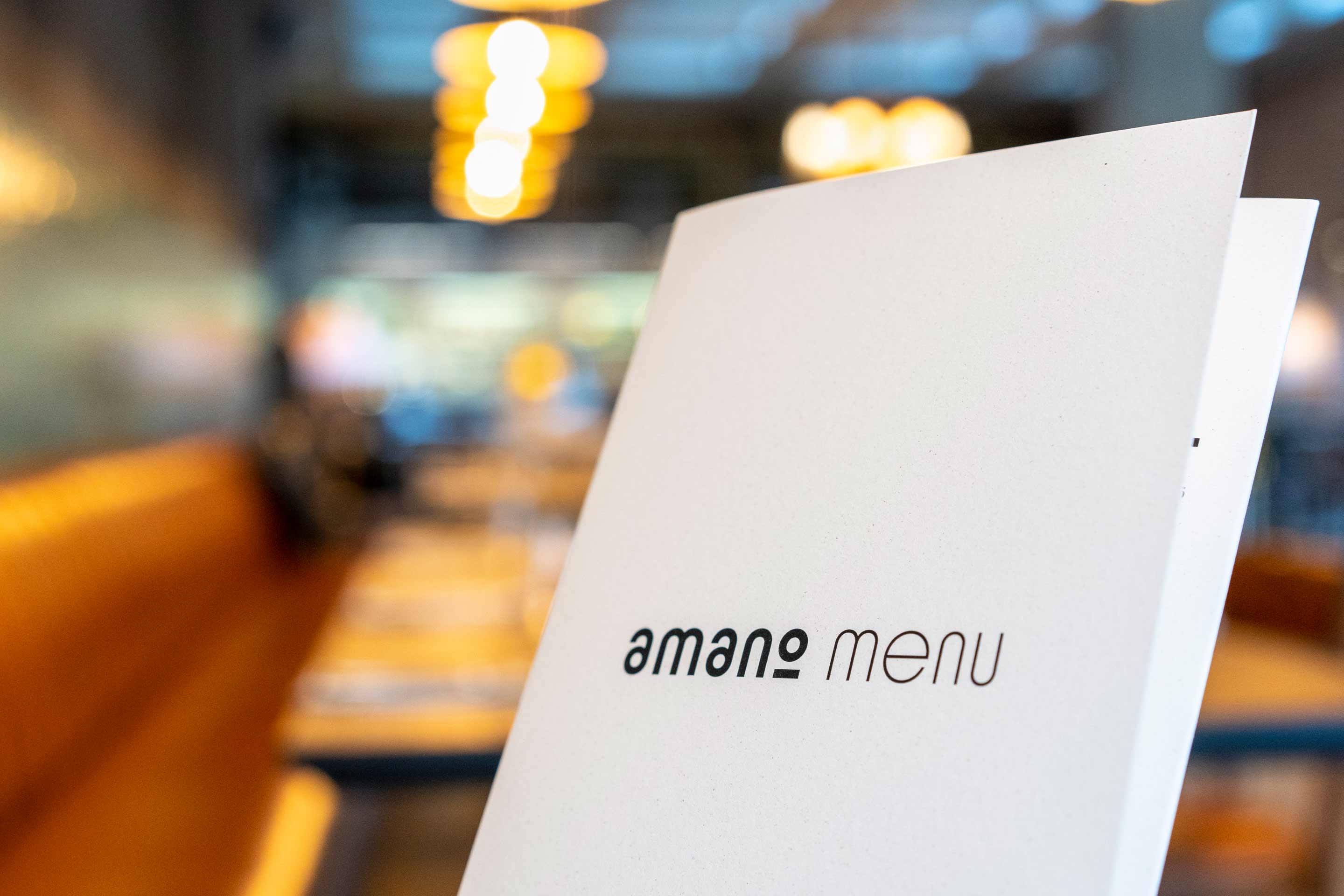
We designed the graphic identity of the Italian restaurant Amano to fit the new industrial space in the centre of Prague. A distinct combination of Sutnar grotesque and a fixed-width font accompanies the menu, business cards, seasonal offers as well as online applications. The logo can be incorporated into texts in a subtle… Read More
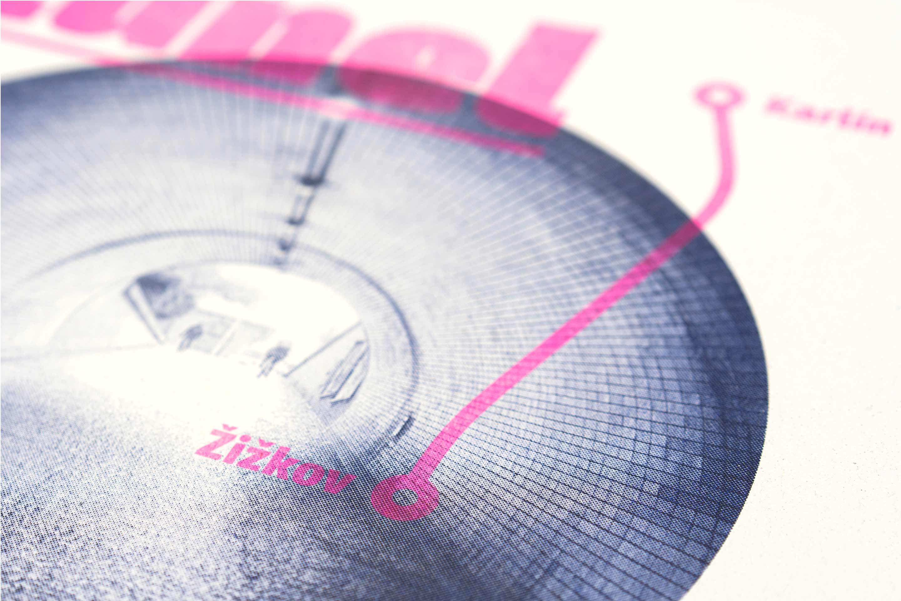
A series of five posters of Žižkov icons was created for the occasion of the neighbourhood festival Different City Experience. From the beginning, the graphics was designed for a specific reproduction in three colours using the Japanese Riso machine in our studio. It was printed with two types of screens on… Read More
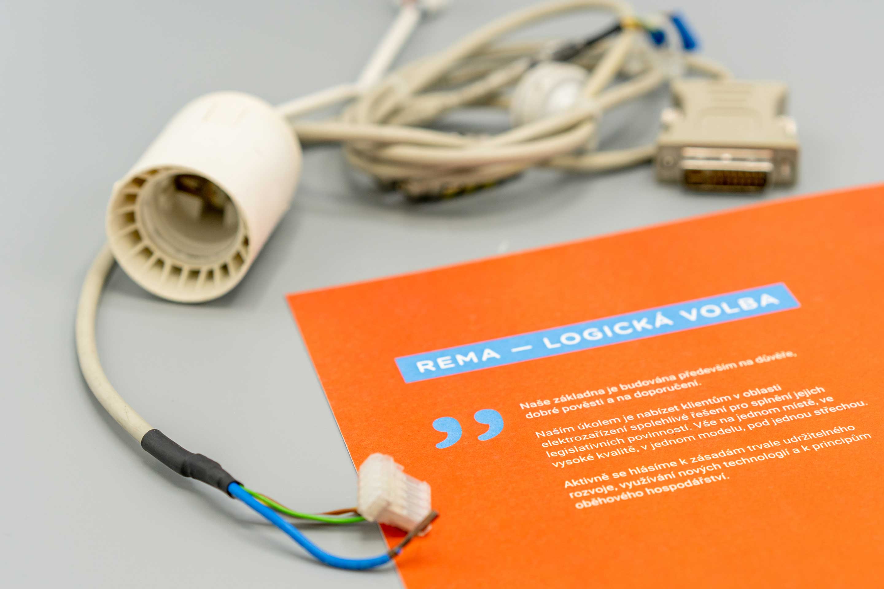
REMA’s annual report is full of shaved wires, burnt-out displays, disconnected circuits and tired motherboards. The journey of retired electronics to silicon heaven has a playful form with a lot of small details. The physical version of the report is printed on glazed recycled paper. Read More
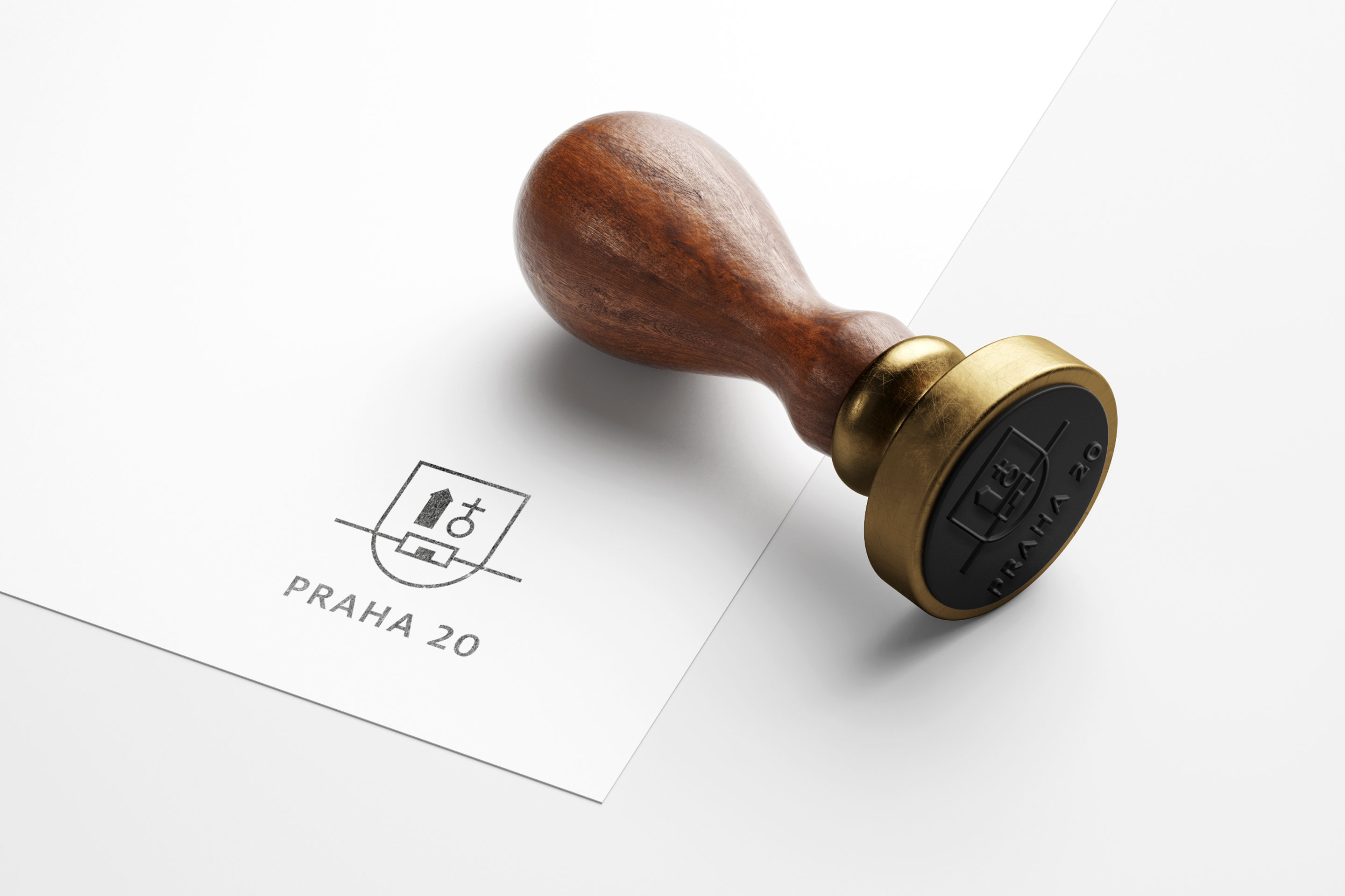
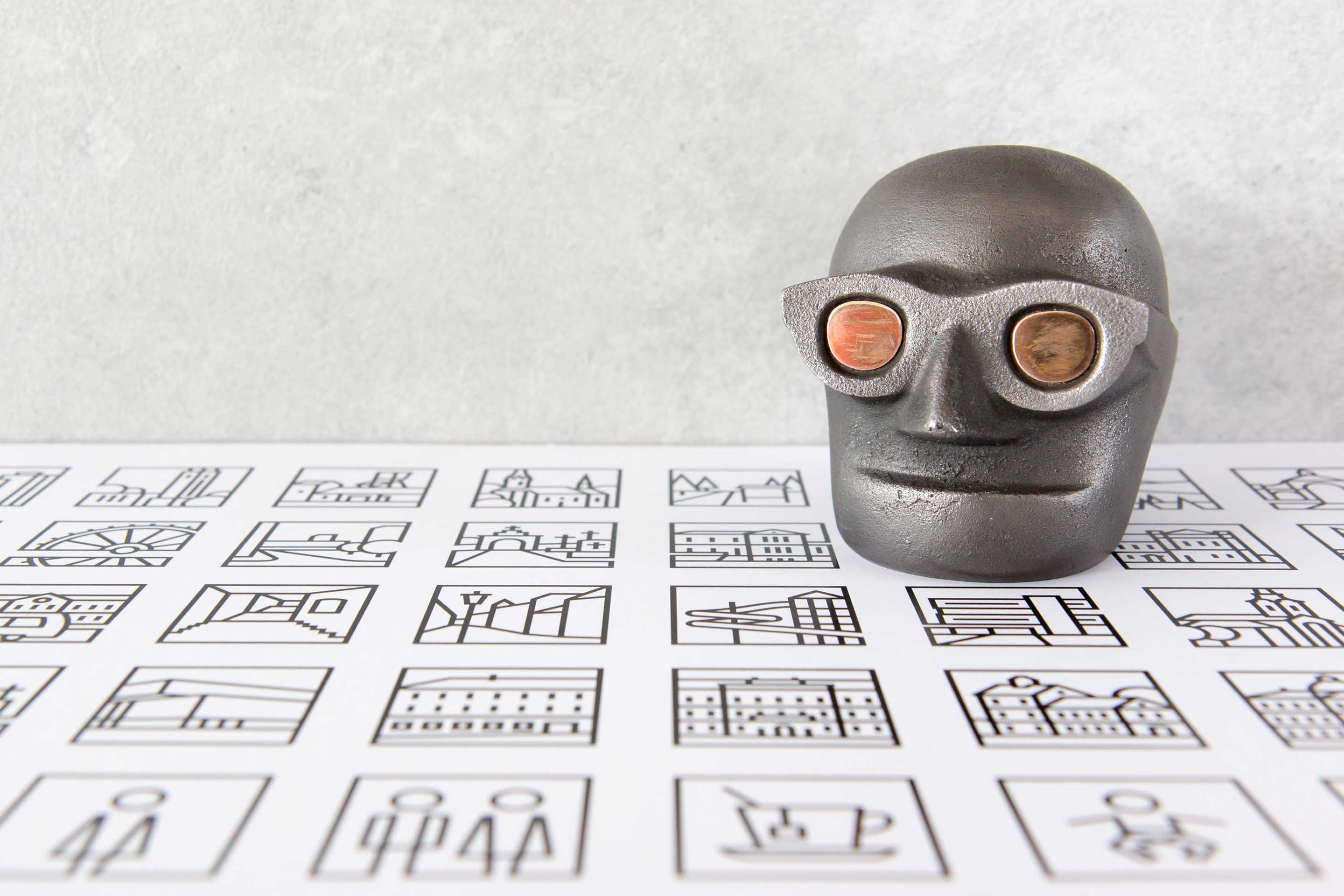
We redraw the heraldry and, in the same proportions, complemented the city district logo using well-known tourist map marks. The whole system is codified by two manuals and is ready for possible adoption by other city institutions. Read More
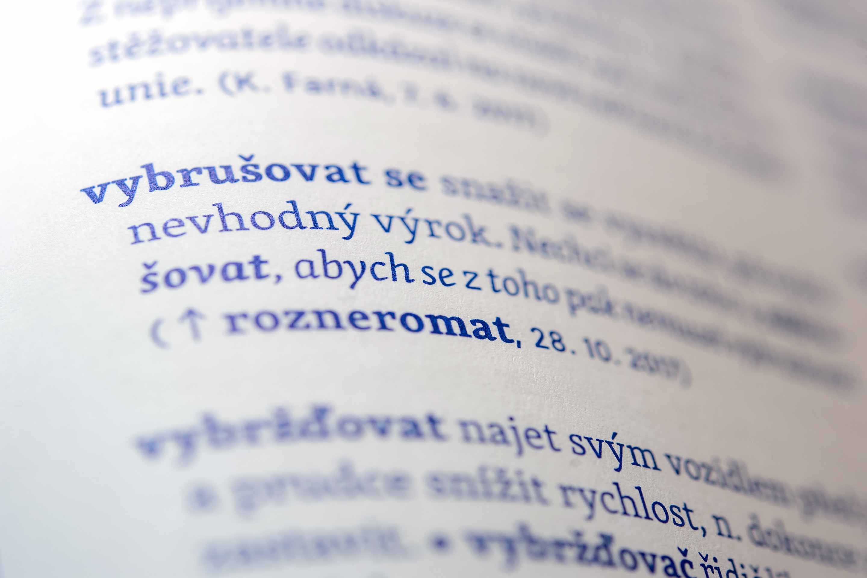
Three thousand definitions, nine interviews with interesting celebrities, and witty illustrations by Lukáš Fibrich — thatʼs „Hacknutá čeština“ (Hacked Czech)! The first ever dictionary you would rather share with your friends over a glass of beer than let it lay collecting dust in your library. Read More
N – for Neuroleadership – this is the term designating unique coaching programs that draw on the latest achievements in neurosciences. The subject theme of mutual communication and the game itself serve as a background of the chosen visual style. Read More

They play golf in Hostivař. And we have agreed to completely re-design their magazine. Besides dealing with the flags and holes, we have made use also of a nice rounded font from the Commercial Type foundry. Read More

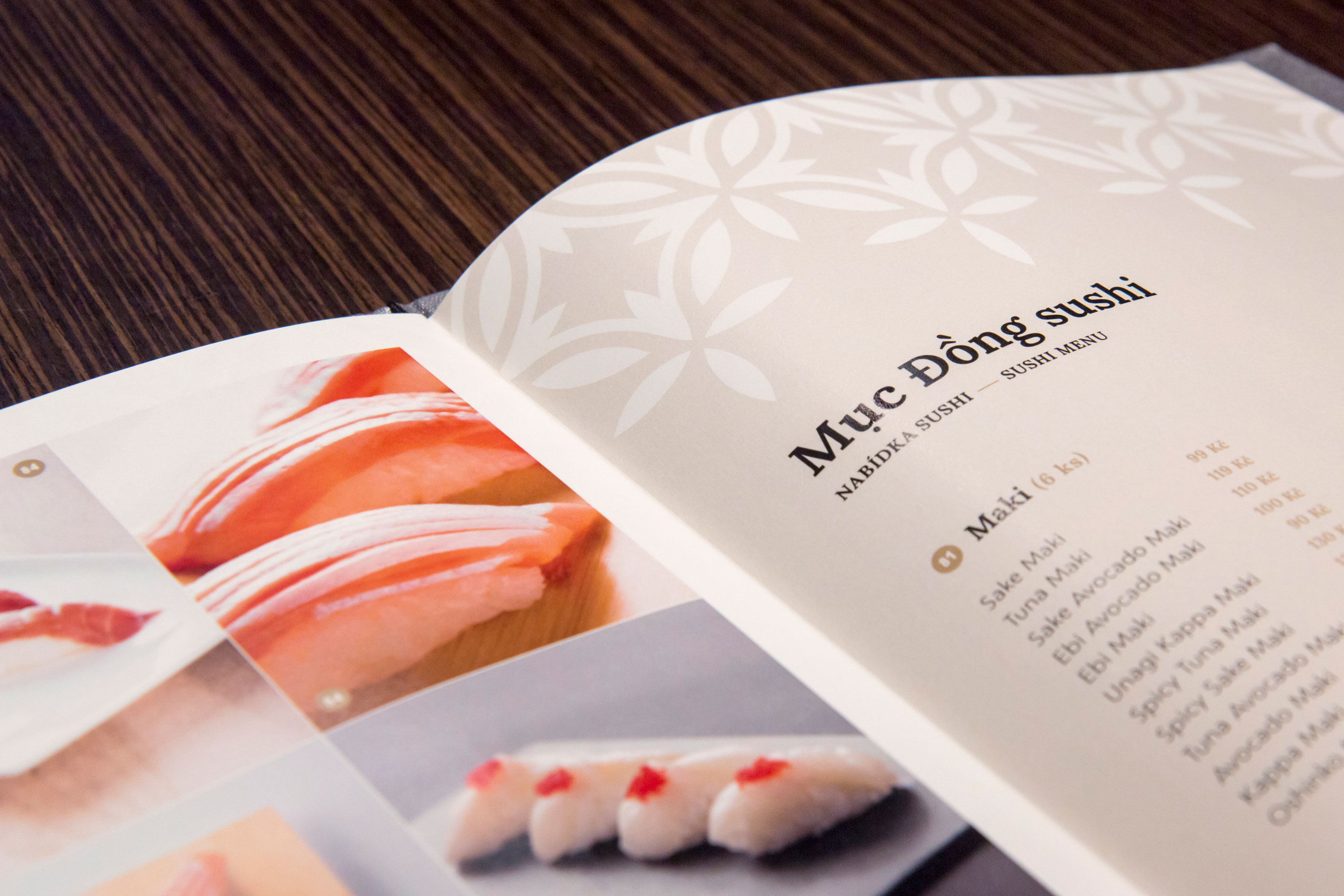
We unified the elements of visual communication of this Vietnamese restaurant in the centre of Prague. The menu is presented in a hardback cover with foil stamping. The inner pages can be easily taken out of the cover and their design is complemented by pictures of chosen meals. The graphic… Read More
Winning concept selected in a two-round competition held by the city. Frýdek≈Místek is divided by a river into two parts of approximately the same size; the city lies on the Moravian-Silesian border. Different variations of a typographic play were used to form the visual style of the city and its institutions. The design… Read More
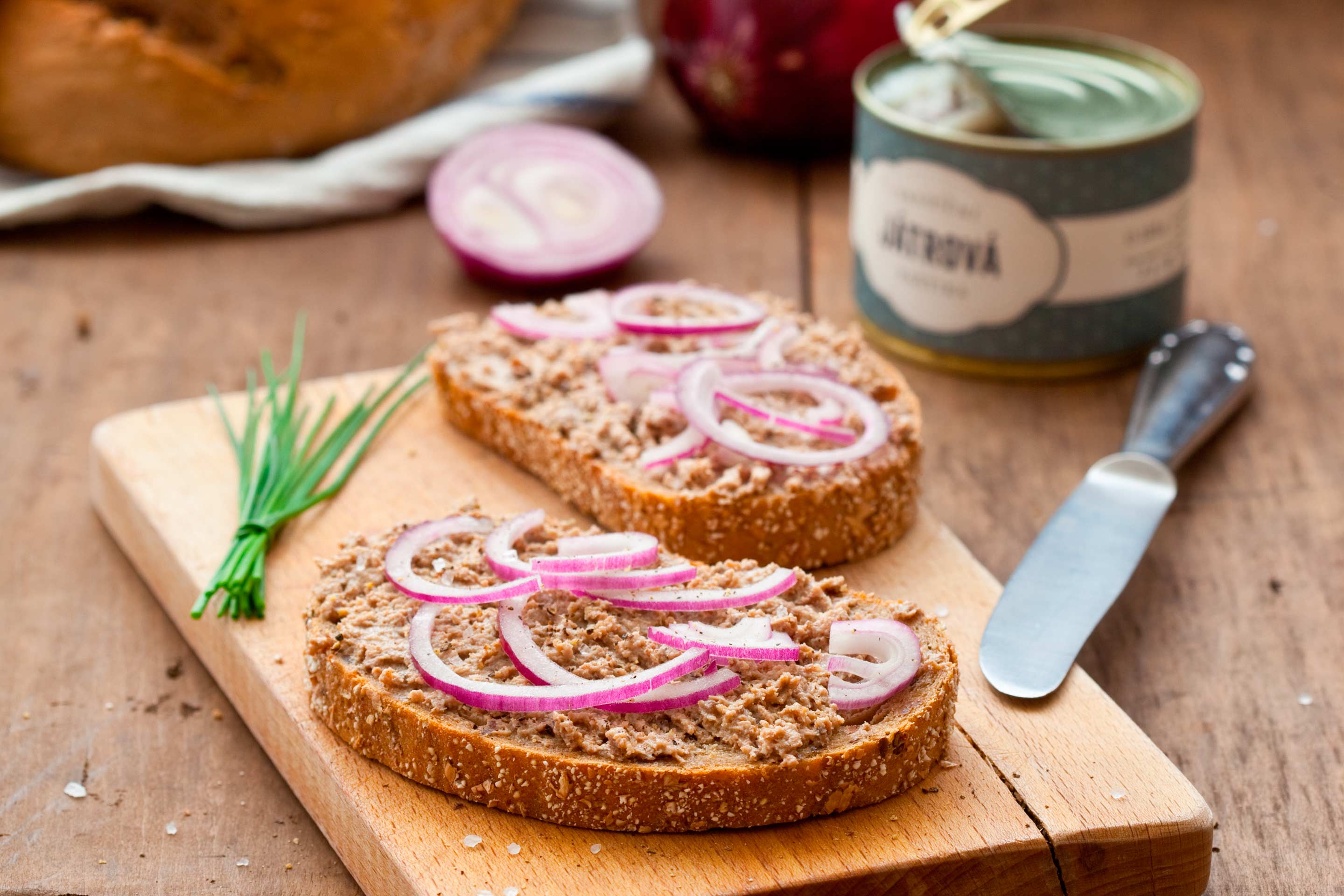
We designed set of basic and luxury labels with metallic design for the line of fine pâtés. The logo was created in cooperation with calligrapher Karolína Stryková. Read More
In 1992, the Czech Republic was officially connected to the World Wide Web: the Internet. Nearly 25 years later, we tried out the technique of overprinting metallic foils on the VIP invitations for Seznam.cz. Read More
The winning design for Příbram, a city with a rich history of mining, situated in the Central Bohemian Region. A simplified version of the coat of arms of Příbram is the guideline for a wide range of pictograms and principles of shared identity of municipal institutions. This work was awarded a bronze Louskáček. Magazine… Read More
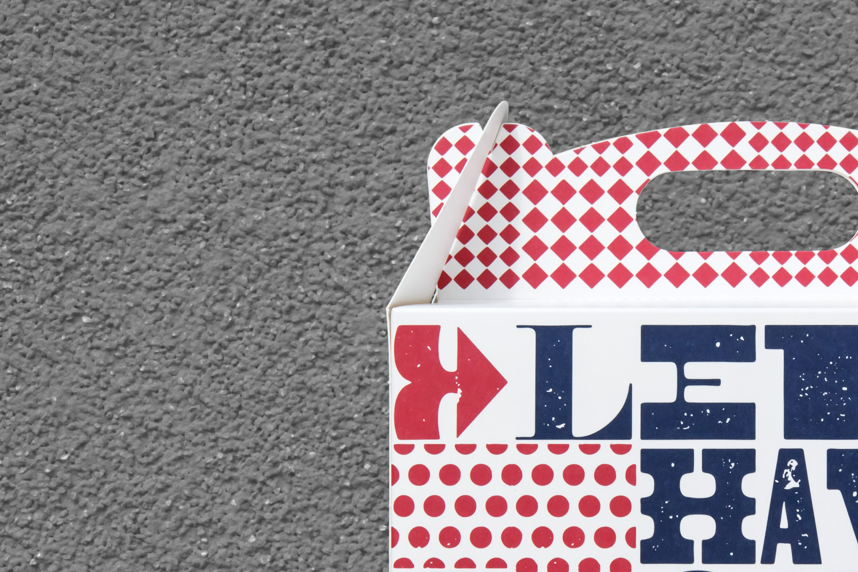
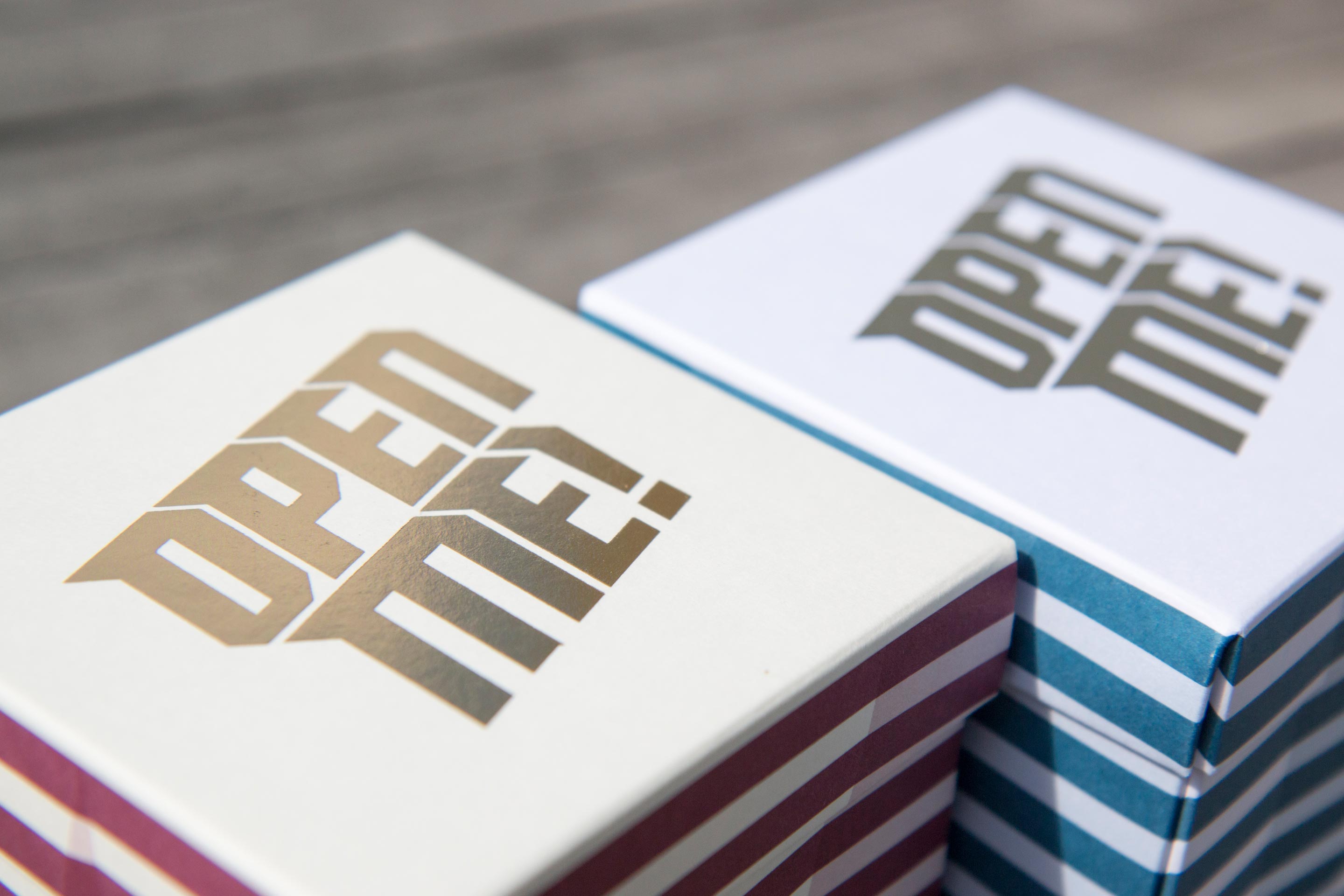
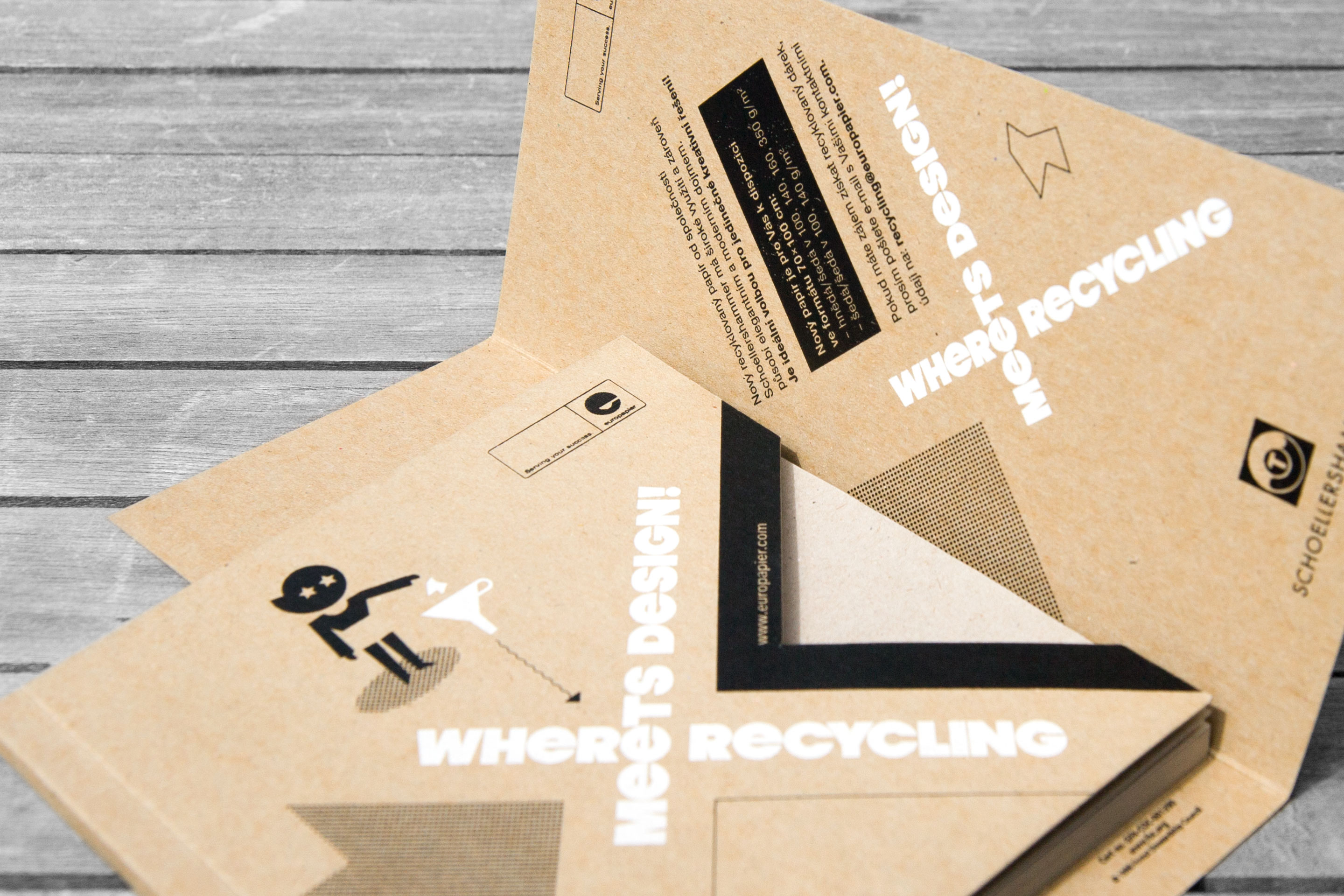
A gift box for the Austrian company Europapier. It was designed to promote the sale of cardboard certified for food contact. Playful typography and colourful raster patterns are organized into interconnected sections. What about studying them more closely while enjoying a delicious piece of cake?… Read More
The zigzag line raster pattern on the gift box creates an optical illusion of an irregular crystal shape. The lid is stamped with hot foil and follows the same graphic pattern. The blue and silver design looks well on white cardboard, whereas the red and gold version pairs well with… Read More
The axisymmetric letter X represents the bustling intersection of the Czech Internet. Visual identity of the NIX.CZ association is based on graphic representation using moving geometric compositions and colour codes characteristic for the Czech and Slovak headquarters. Read More
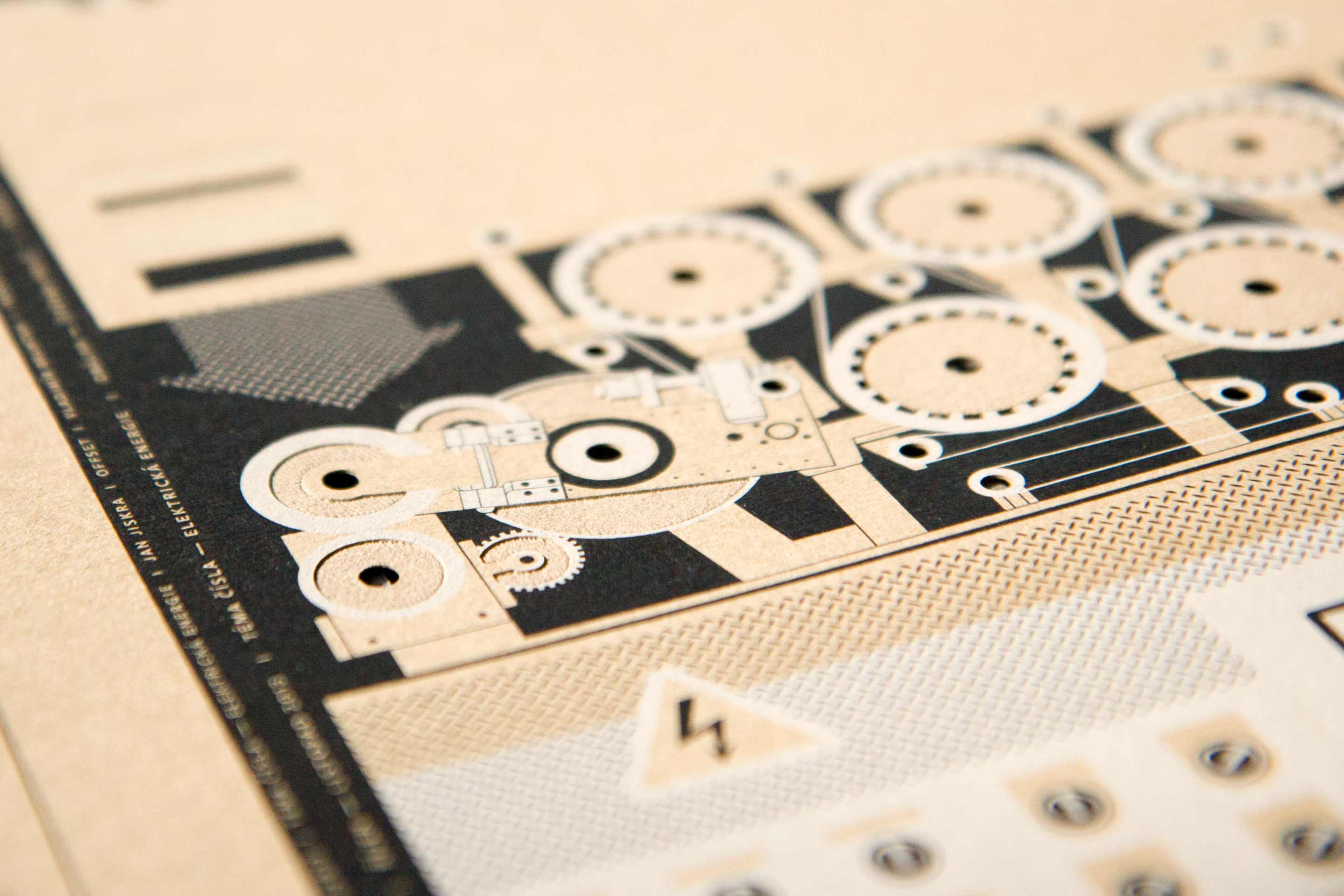
Our design combines the main topic of the issue — Energy — and the presentation of a new line of Schoellershammer recycled papers. The magazine was printed on an offset press, using black and opaque white ink. The final look was accomplished by engraving and laser cutting. Read More
A series of creative materials promoting new recycled paper on the Czech market. When flipping through the notebook, the paper “falls” into the bin in the down-left corner. The production techniques used were screen printing and punching. Read More
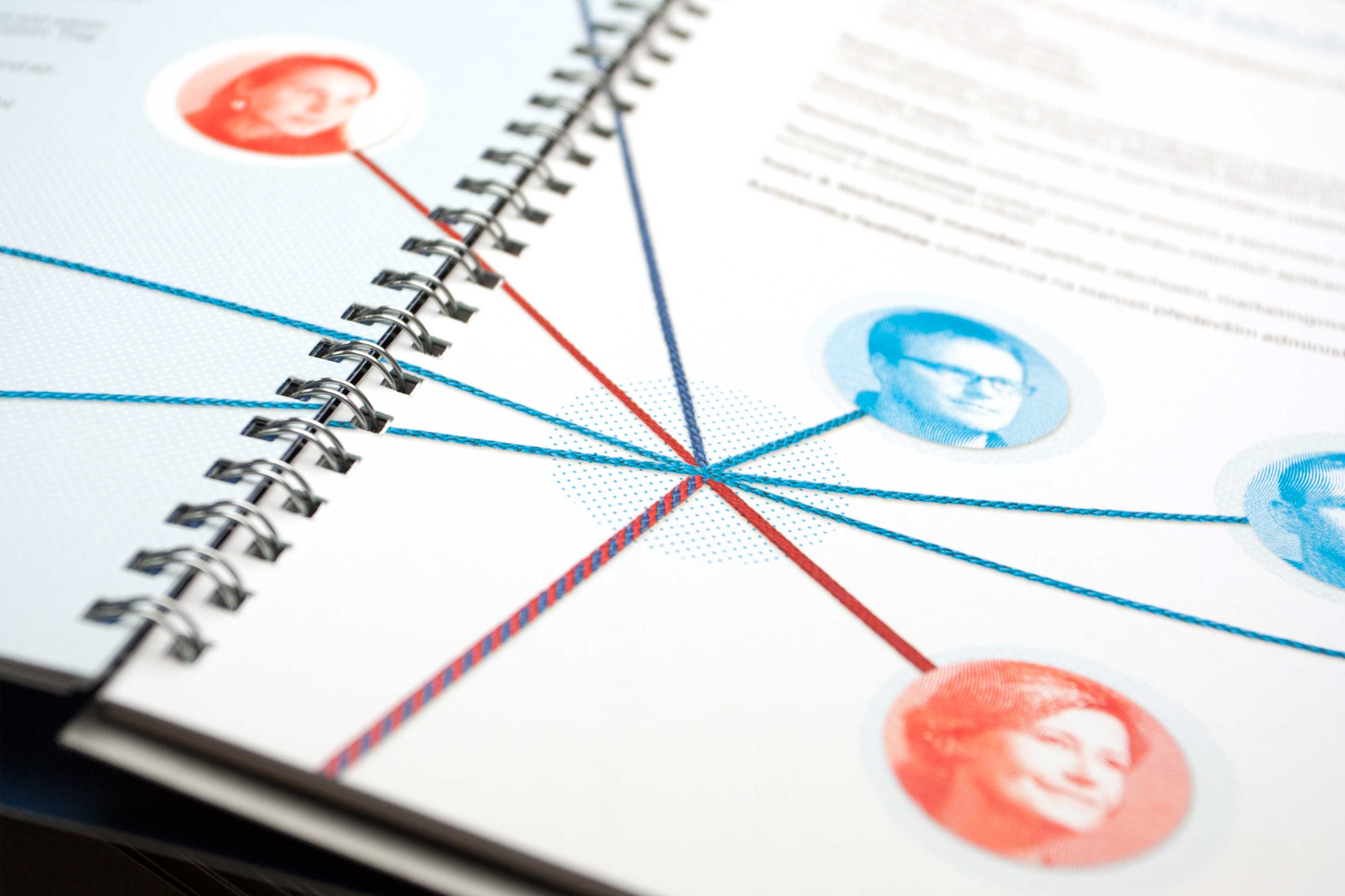
Annual Report full of internet connections and knots. We transformed the digital world into cardboard cities connected by handmade strings. On the whole, three printing technologies together with a number of finishing operations have been applied. Read More
Creating a good-quality identity for a new political party was a challenge. From the beginning, this logo concept has been designed as part of dynamic graphics: it can grow to unlimited extension, combine colours and the size of shapes. The human chain can be linked together, or break at will as a perpetual clash… Read More

The visual identity of the Hussite exhibition in Tábor is one of our largest projects. The exhibition is set in the nine halls of the Gothic city hall. We cooperated with architects and provided all the design, from small-scale captions to large graphics. The exhibition won the Gloria Musaealis award… Read More
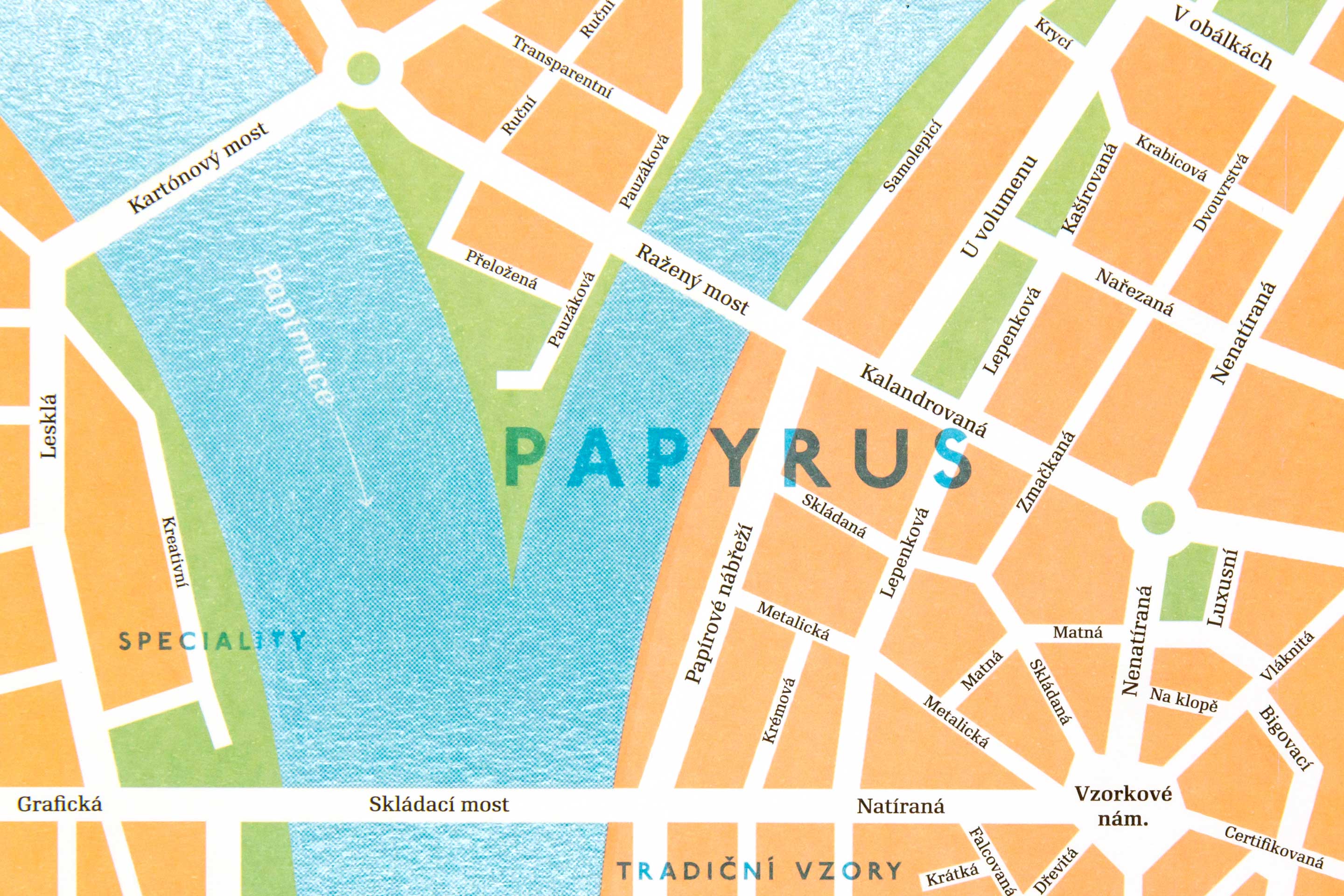
A set of luxury notepads for Papyrus clients with the Company logotype repeated consistently in all of the sizes. The envelopes are printed by a combination of Pantone colors, partial lacquer and raster laser cutting technologies have been used. Read More
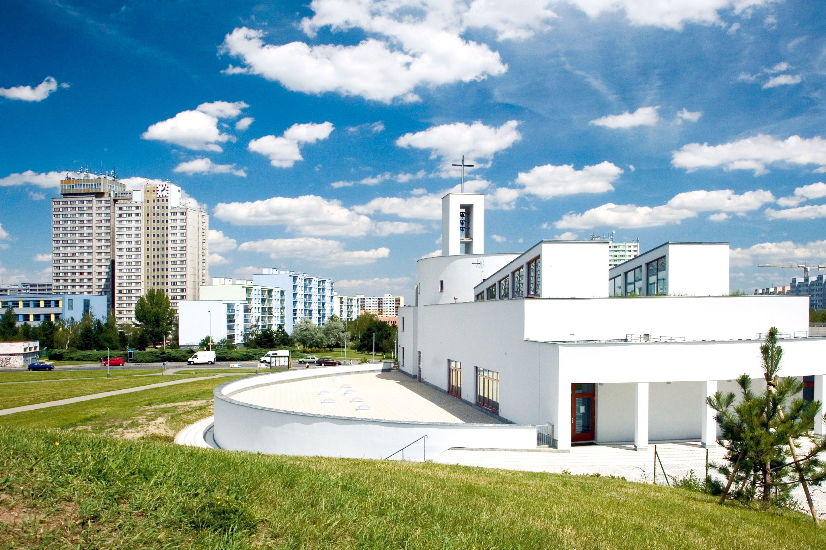
The number fourteen serves as a graphic representation of an urbanized landscape on the outskirts of the city, seen from the bird’s-eye view. The predominant feature is the green vegetation with a body of water motive in the middle. The figure 14 is formed by dividing traffic routes. Winning design in a tender. Read More
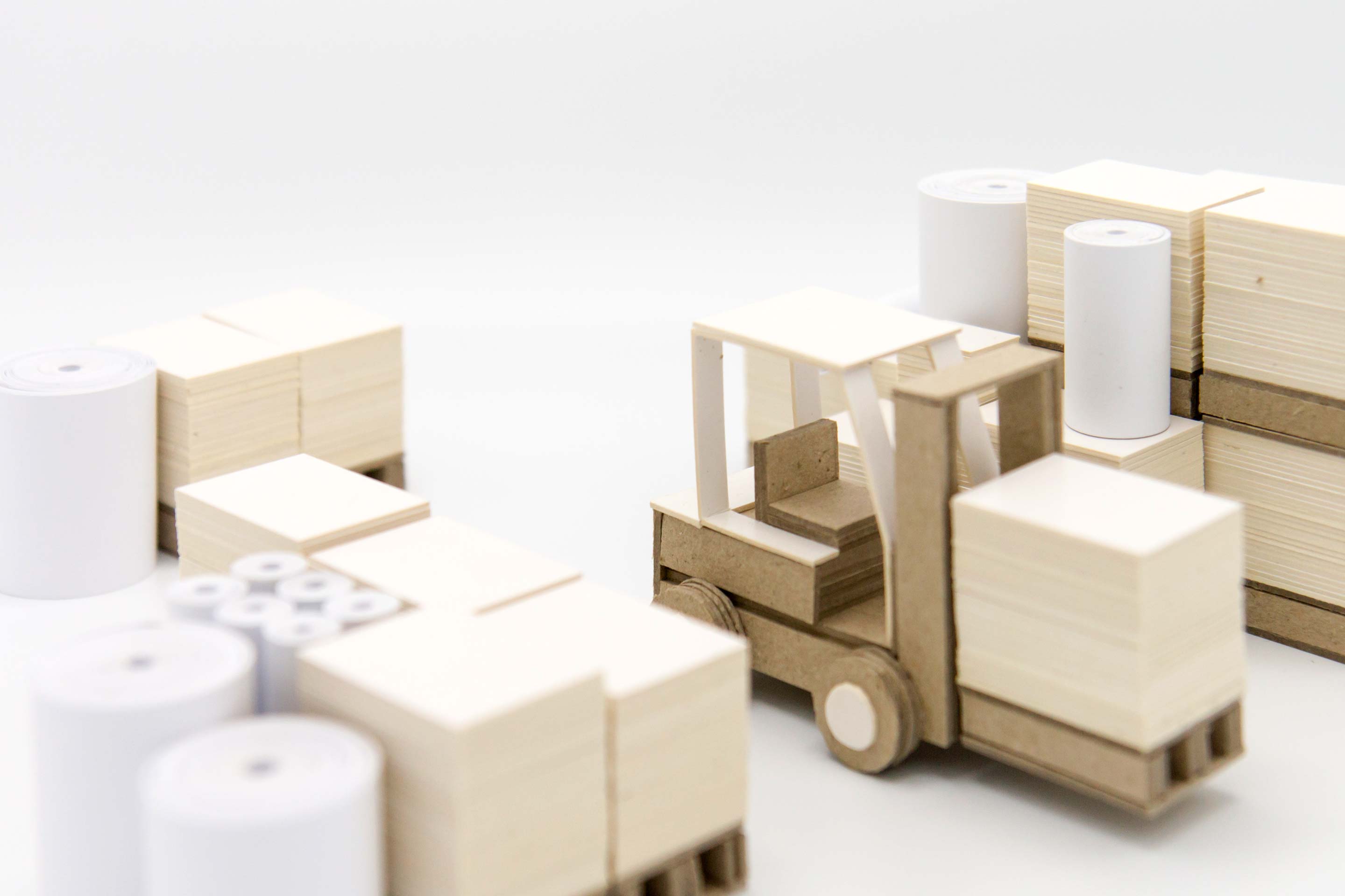
We created a paper miniature of a paper warehouse. The forklift made from white and natural cardboard became a significant component of the design. Just one more pallet to go and the job is done. Number 20 is complete – representing Europapier’s 20 years in business. Read More
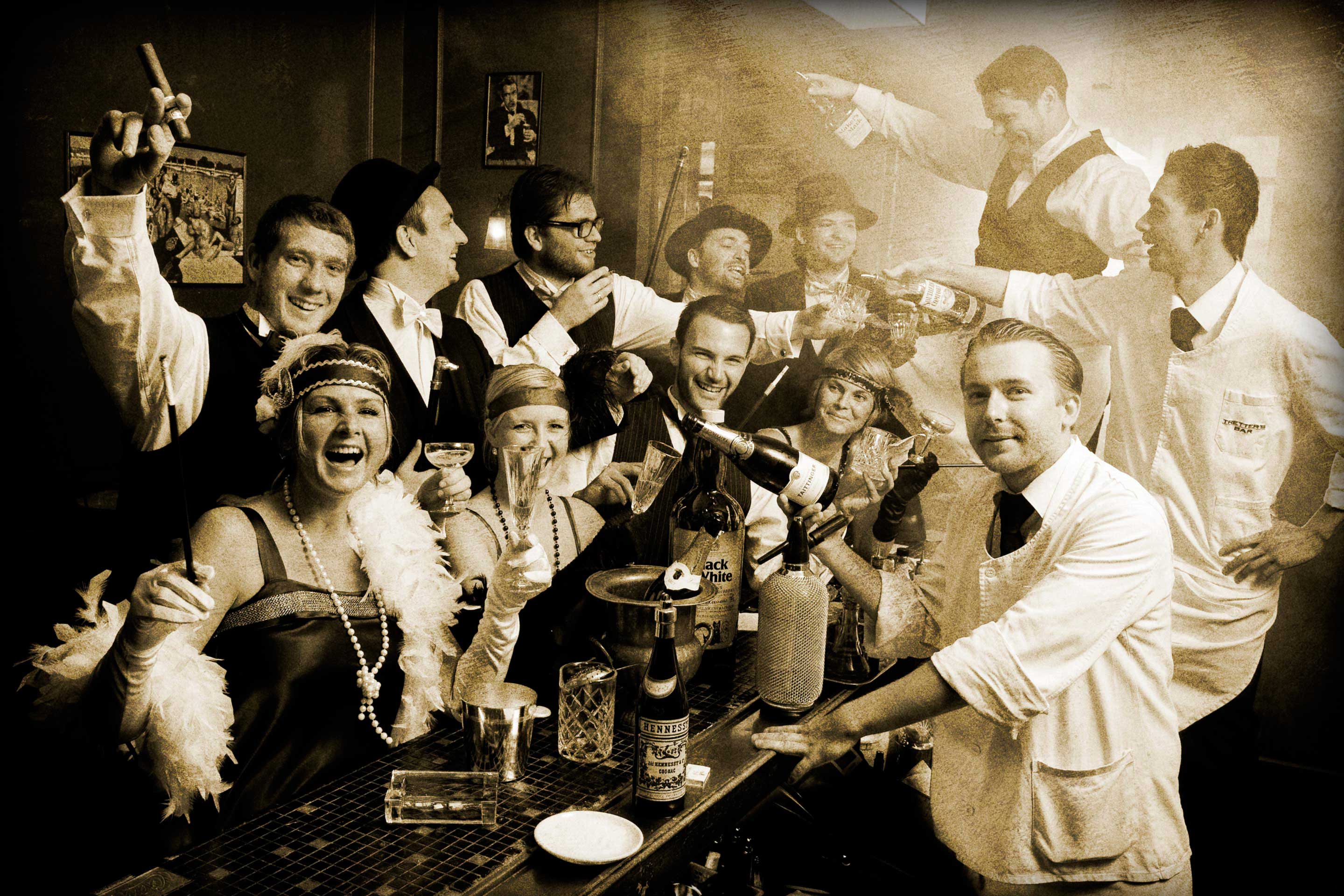
The cocktail menu for a famous cocktail bar in Prague. The atmosphere of the 1930s captured in a sturdy sewn binding, in a hardback cover with metallic foil stamping. Read More
The winner of a tender for the visual style of the City District Prague 11. Number 11 is formed by the outline of building blocks characteristic for the skyline of Prague’s periphery. Graphic charter was accompanied by a redisign of the Klíč magazine, as well as brochures and other materials. This simple symbol… Read More
An exhibition “From Kolben to ČKD” was launched in the city hall on the occasion of presenting Jindřich Kolben with an honorary citizenship of the City District Prague 9. We designed posters, invitations, the exhibition brochure and a series of eleven large information boards. The design of the poster and the… Read More
Menu for a stylish cocktail bar in the centre of Prague. The dark blue menu cover is stamped with a silver foil. The design of inner sheets results from mixing two direct colours in different ratio. Each menu section is introduced with a distinctive heading that nicely complements the overall lively layout of… Read More
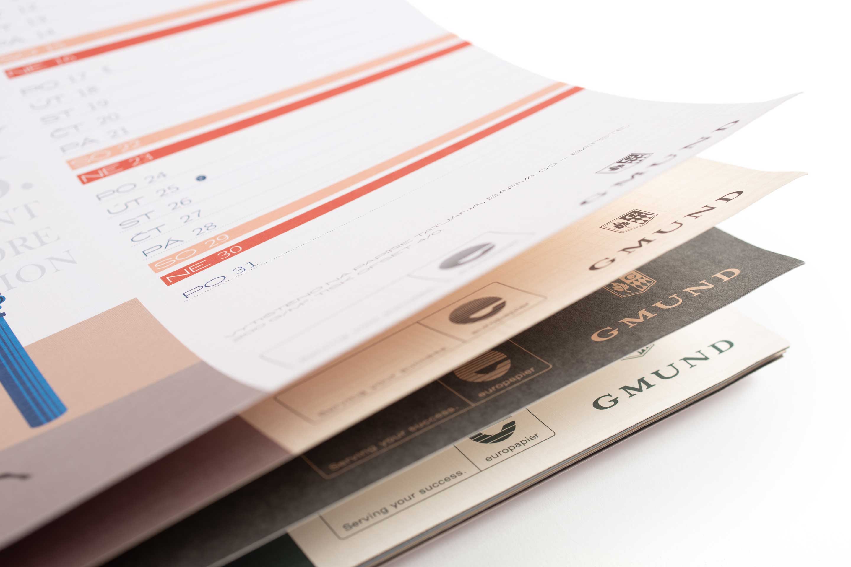
The calendar for Europapier consists of 13 vector drawings printed on Gmund luxury paper. A number of printing techniques have been used – screen printing, blind embossing, hot stamping, pattern coating or letterpress printing. Awarded in Calendar of the Year competition. Read More