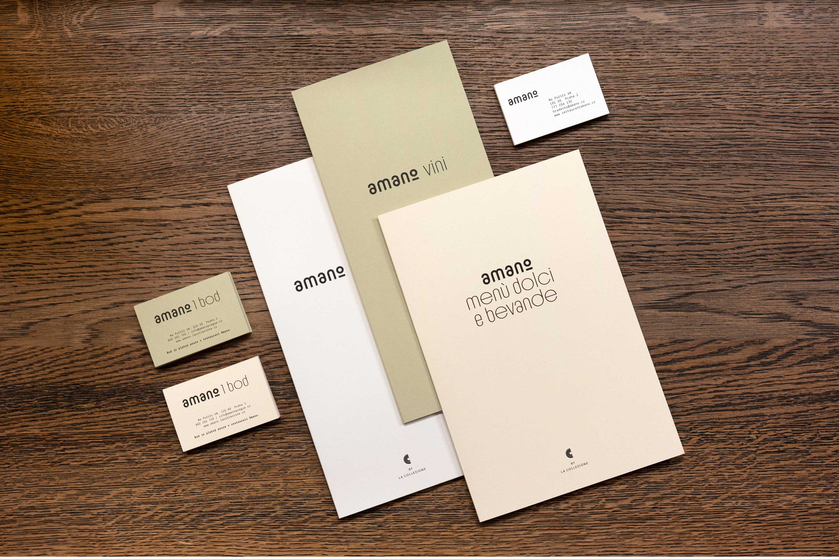
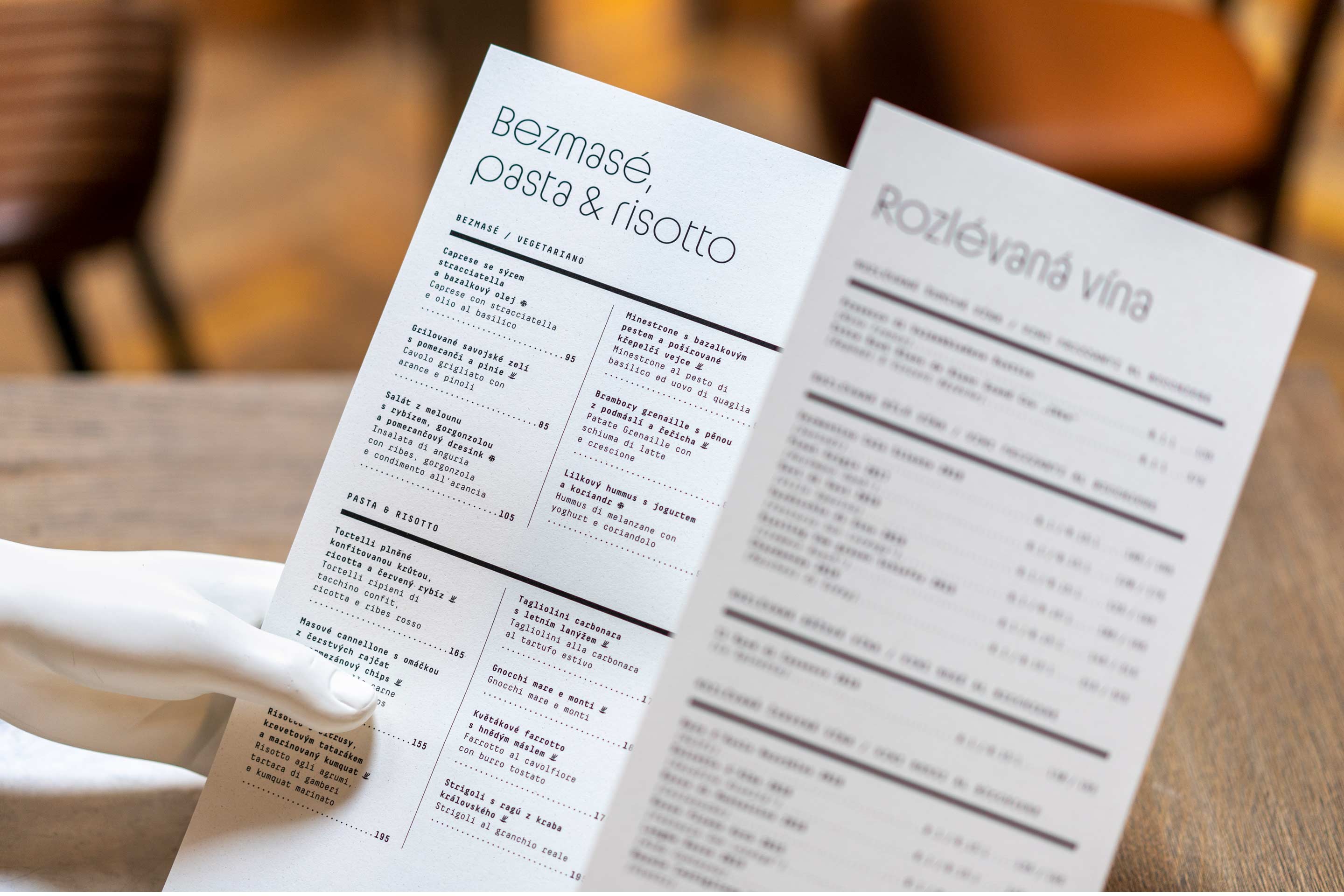
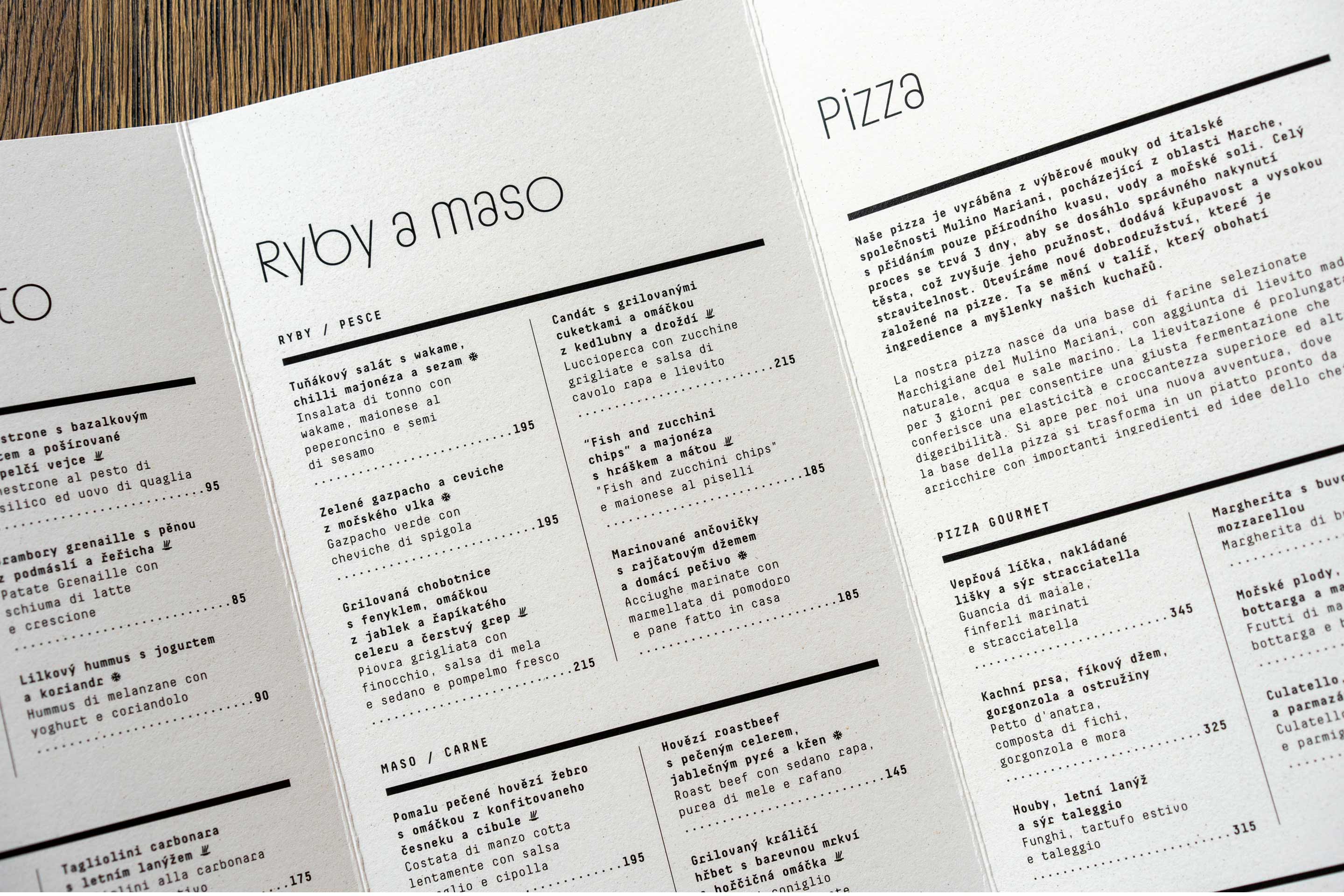
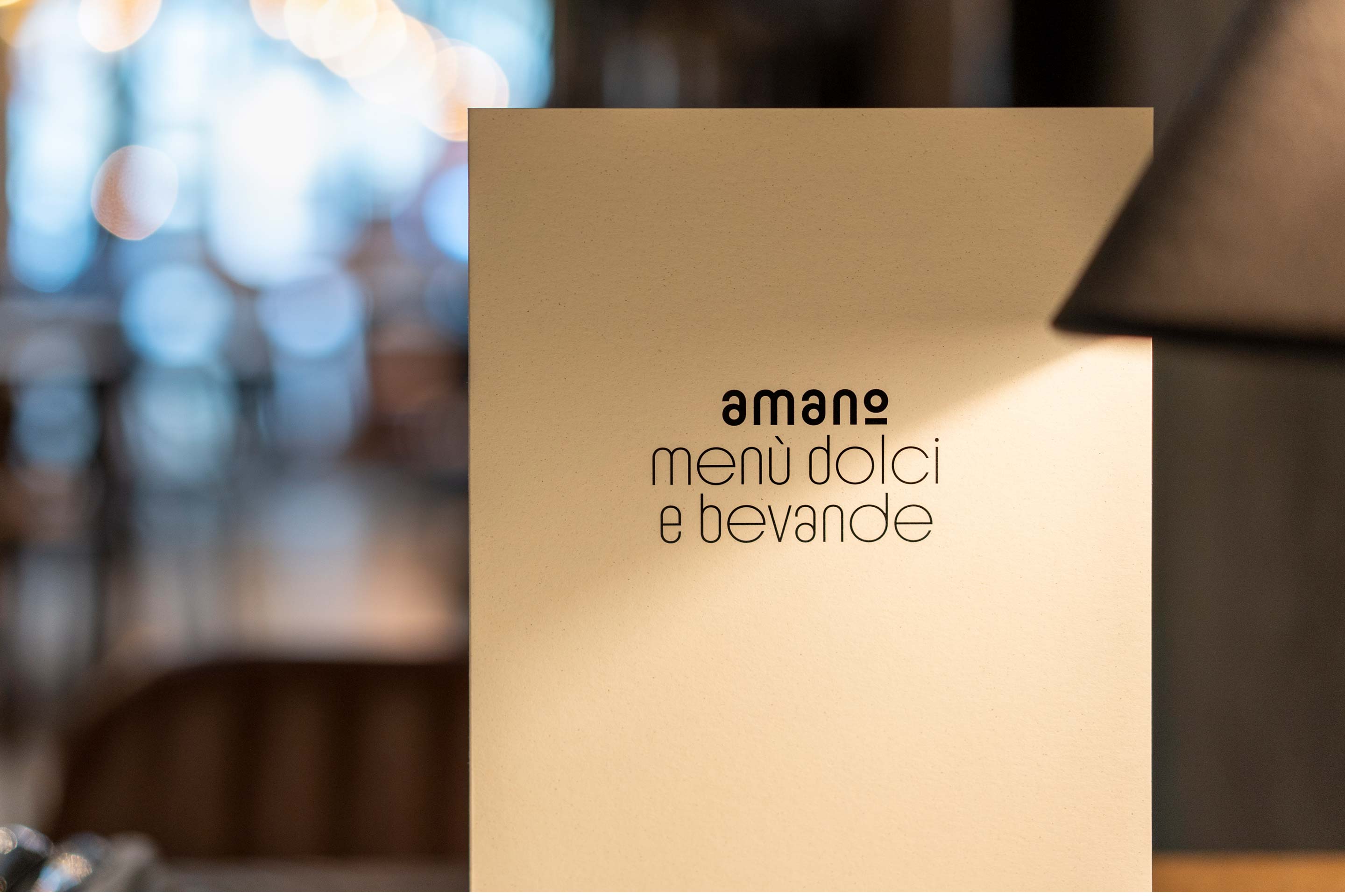
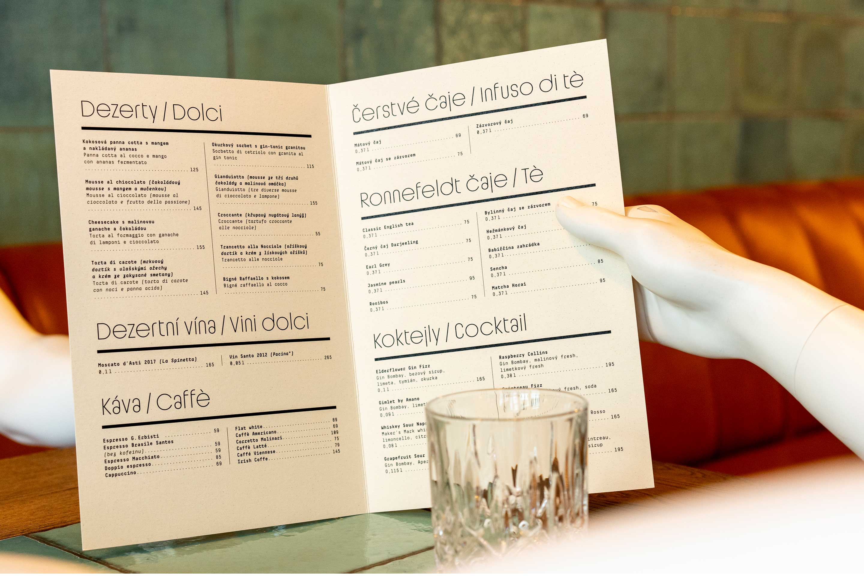
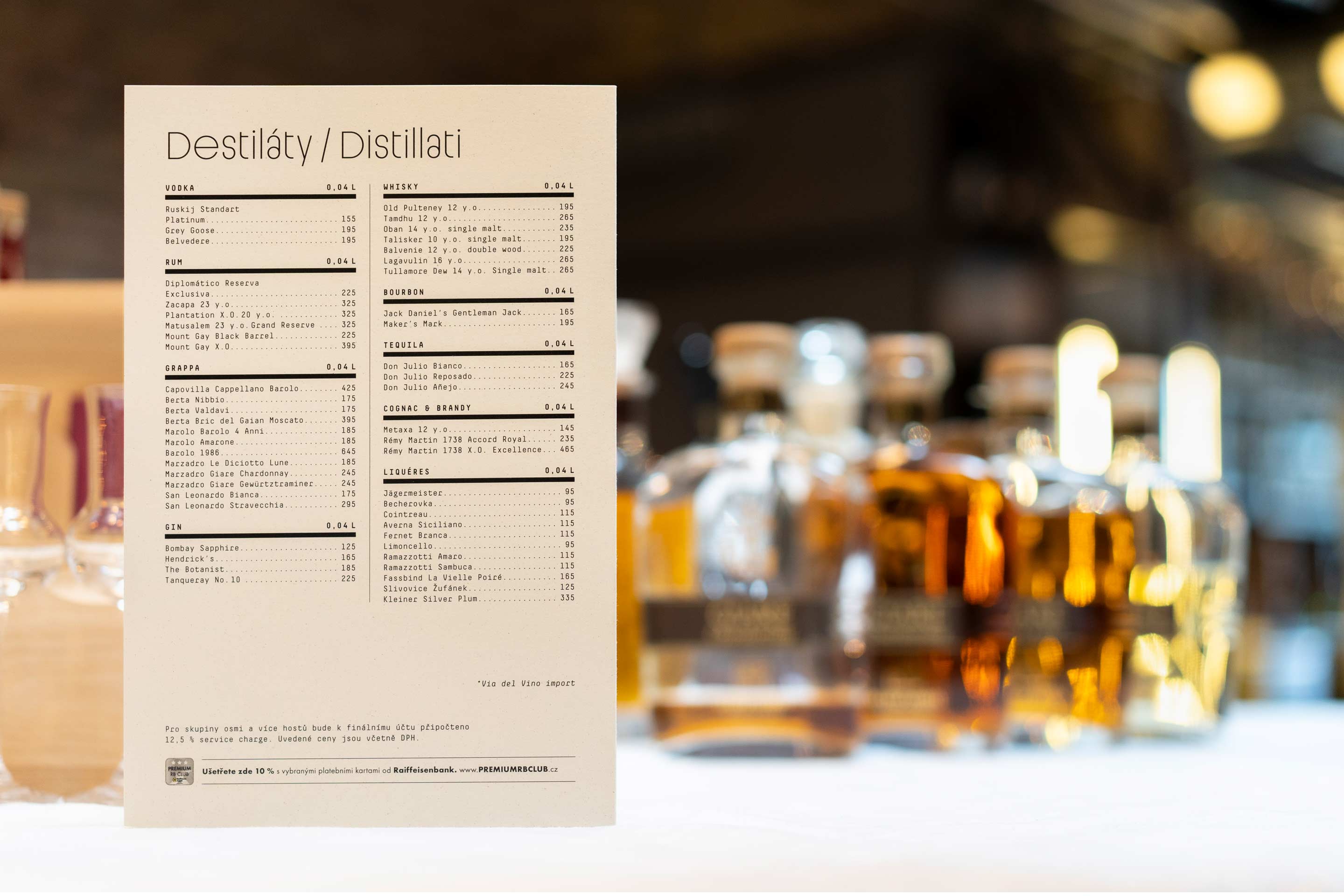
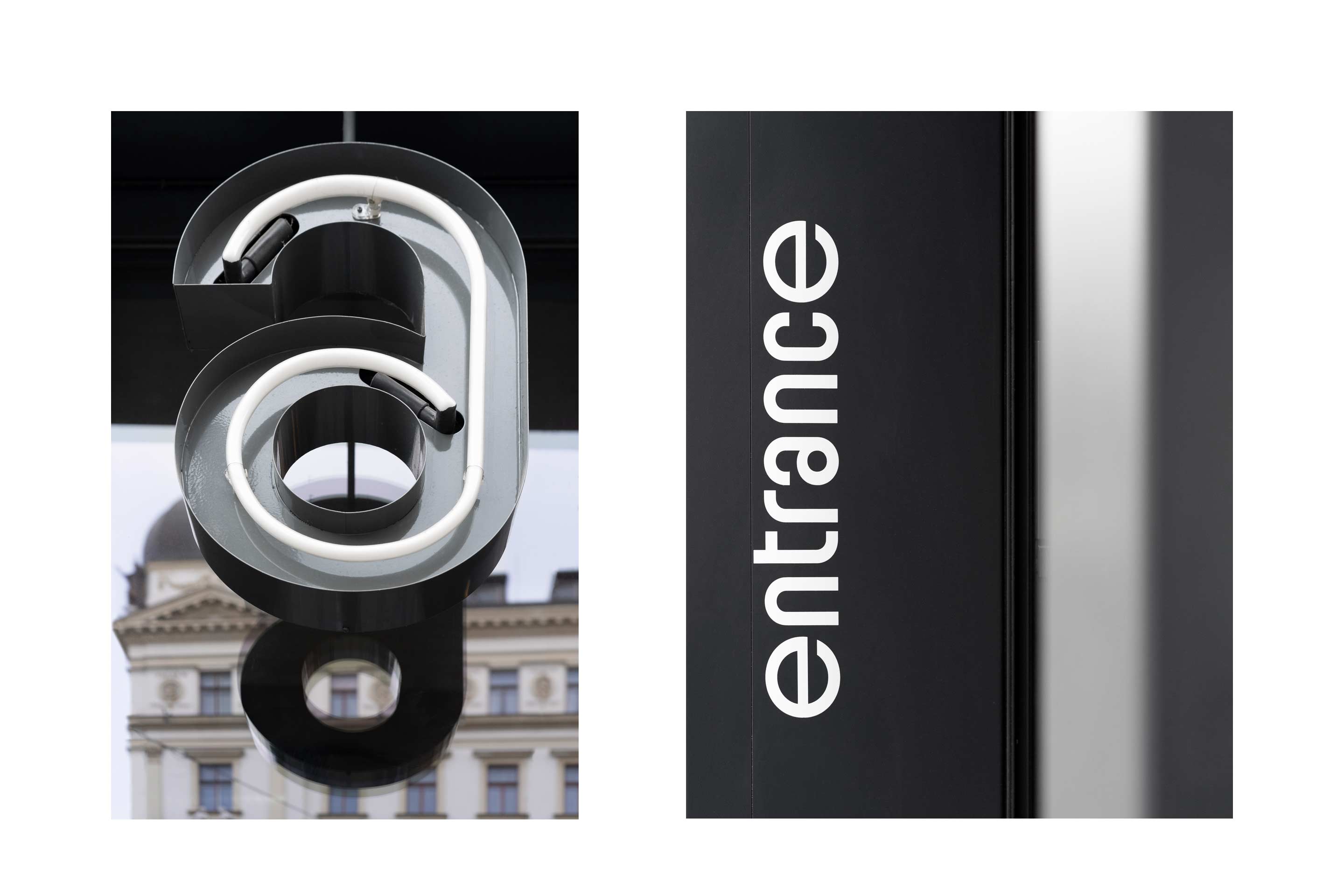
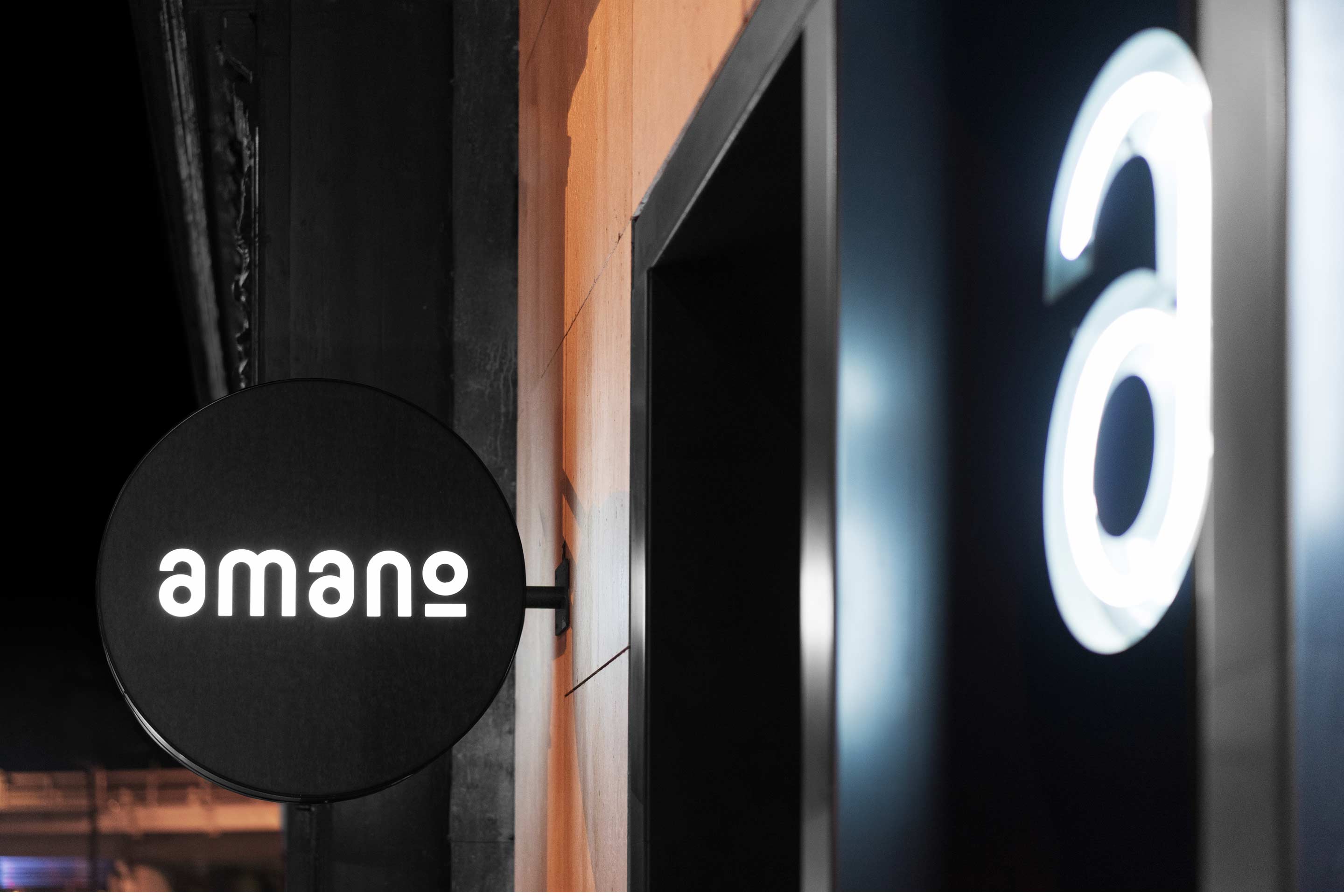
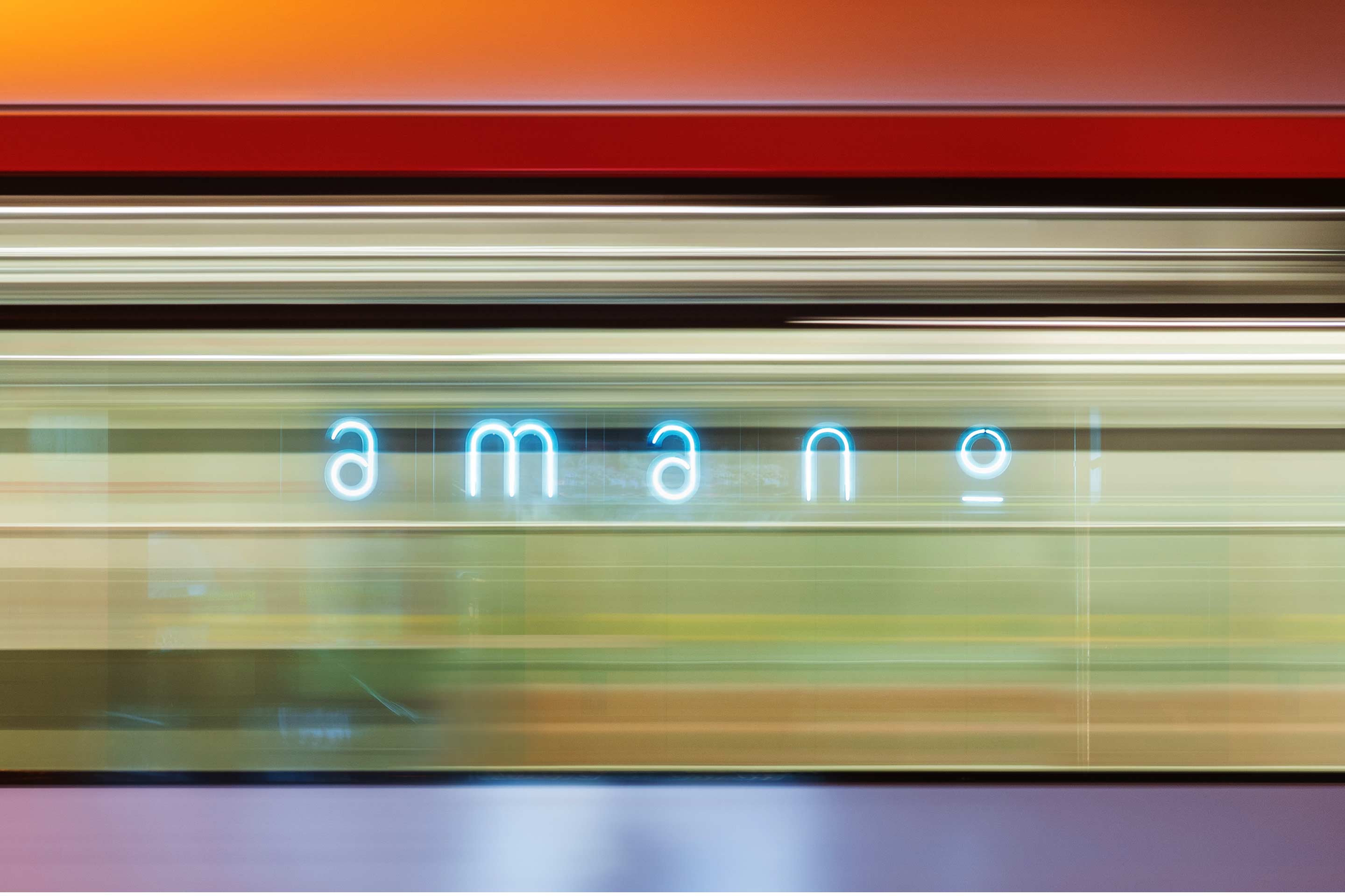
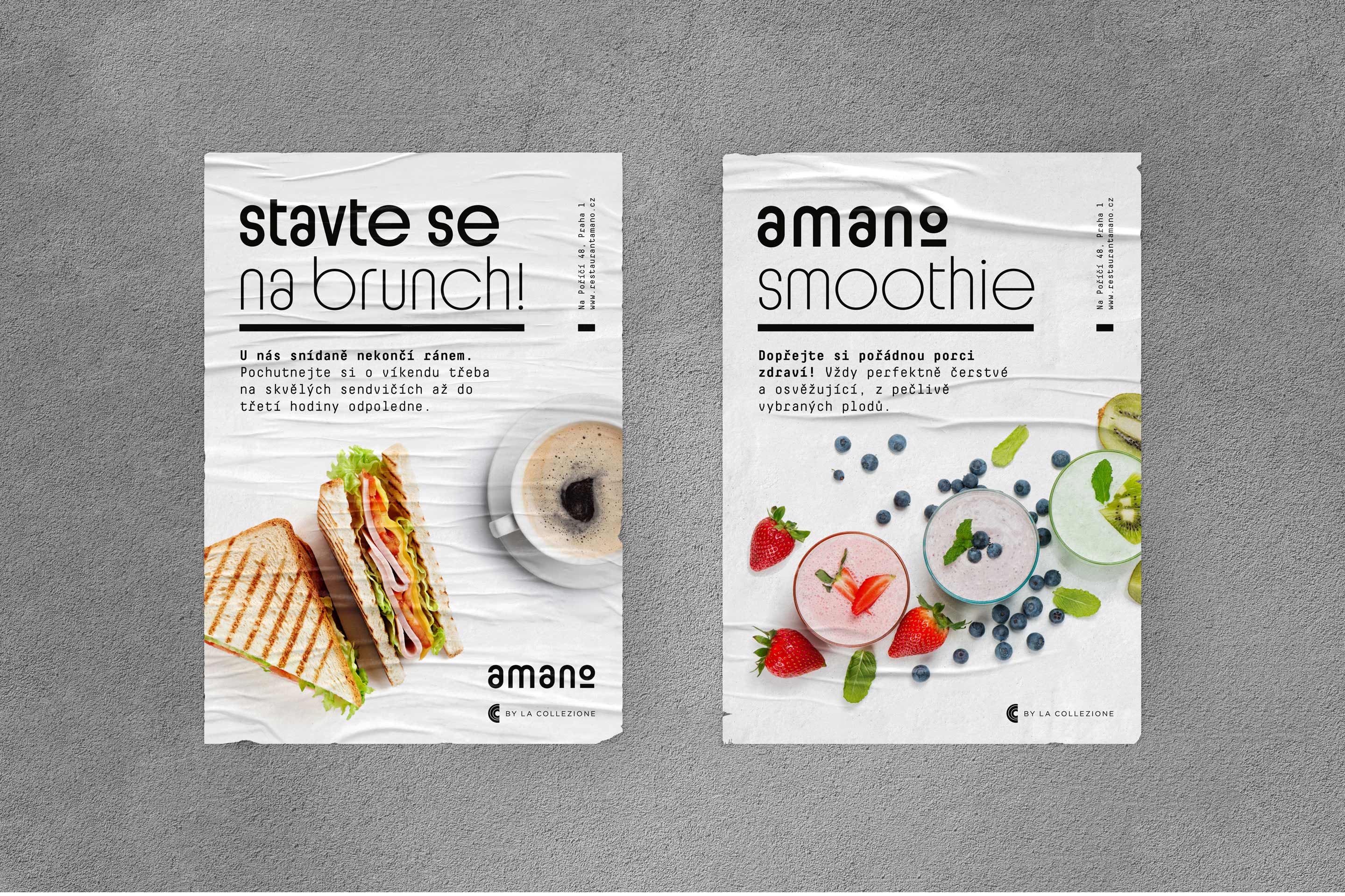
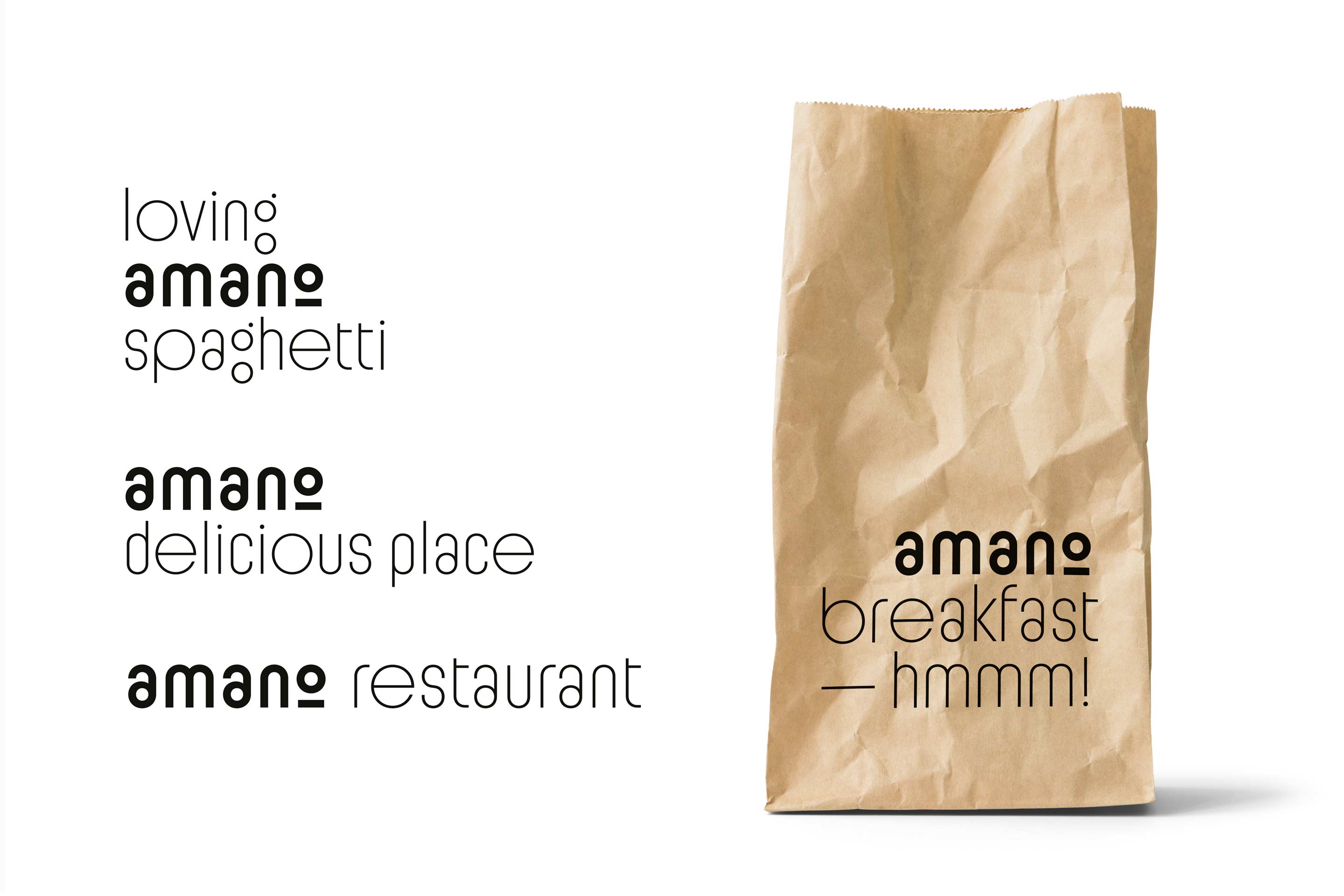
We designed the graphic identity of the Italian restaurant Amano to fit the new industrial space in the centre of Prague. A distinct combination of Sutnar grotesque and a fixed-width font accompanies the menu, business cards, seasonal offers as well as online applications. The logo can be incorporated into texts in a subtle way or lit up in the form of neon tubes.


We created a graphic identity for the backbone Czech cycle route in the South Bohemian Region. The combination of text and the characteristic meanders of the Vltava River form the building blocks for an endless series of derived motifs. The system is ready for further language versions.

Most has enough of everything! We focused on the current face of the city and its peculiar mood. We designed a brutalist headline font “Dost Sans” for the city and a system of graphic horizons that can easily adapt to a specific medium. The chosen colour scheme reflects both the historically experienced blue tones and the green colour, as Most is one of the greenest cities in the country.

Winner of the competition for the visual style of Prague cemeteries and funeral services. After removing the horizontal partition, the “H” symbol opens the gate and lets life into the cemetery grounds. The negative space in the mass of the letter refers to the significant architecture of chapels, tombs and gravestones. Illustrations by Maria Makeeva.
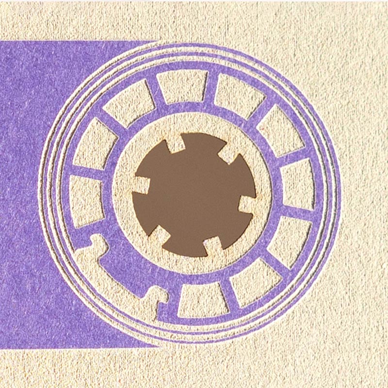
We have designed them a unique swatch book featuring dozens of beautiful papers and their refinement possibilities. The connecting theme is a series of audiocassettes that we had laser cut, engraved, hot foil stamped or partially varnished.
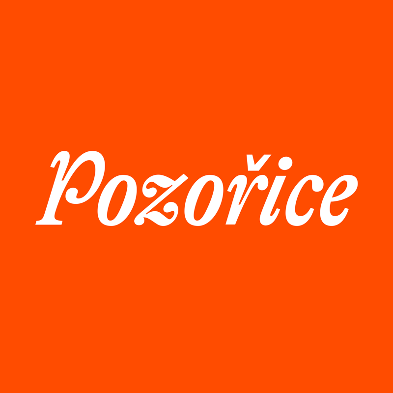
Winner of the competition for the visual identity of the South Moravian town of Pozořice. The deliberately colourful and playful mosaic of labels corresponds to the local nature. The texture colour scheme is inspired by the local traditional costumes and is completely flexible — it can be enlarged or recoloured according to the specific application.
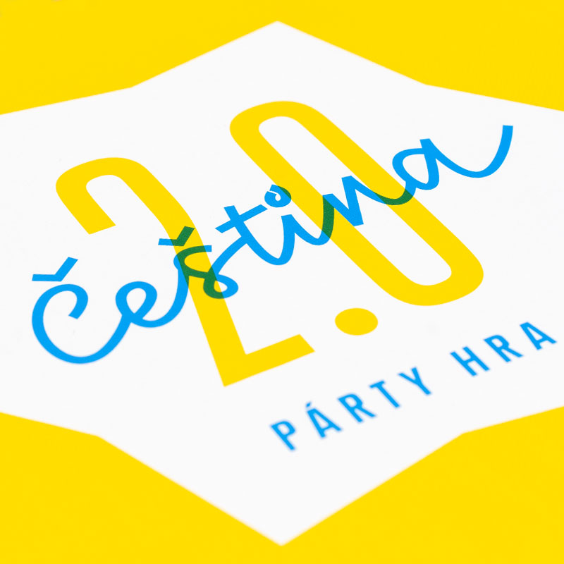
The new party game Czech 2.0, which we had the honour to graphically dress up, has the answer to lot of tricky linguistic questions. The illustrations were done by Lukáš Fibrich.
E-waste is a reservoir of valuable raw materials. We have created a logo and identity for the Smart Recycling project, which helps raise awareness about the environmentally friendly disposal of end-of-life appliances. The contours of the objects circulate in closed cycles and are a characteristic element of the graphic applications.
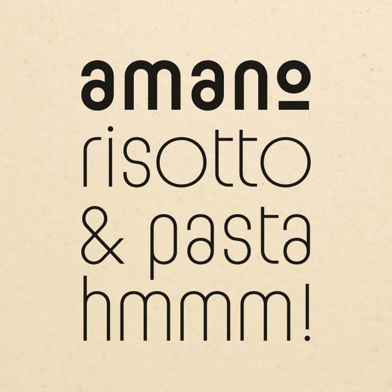
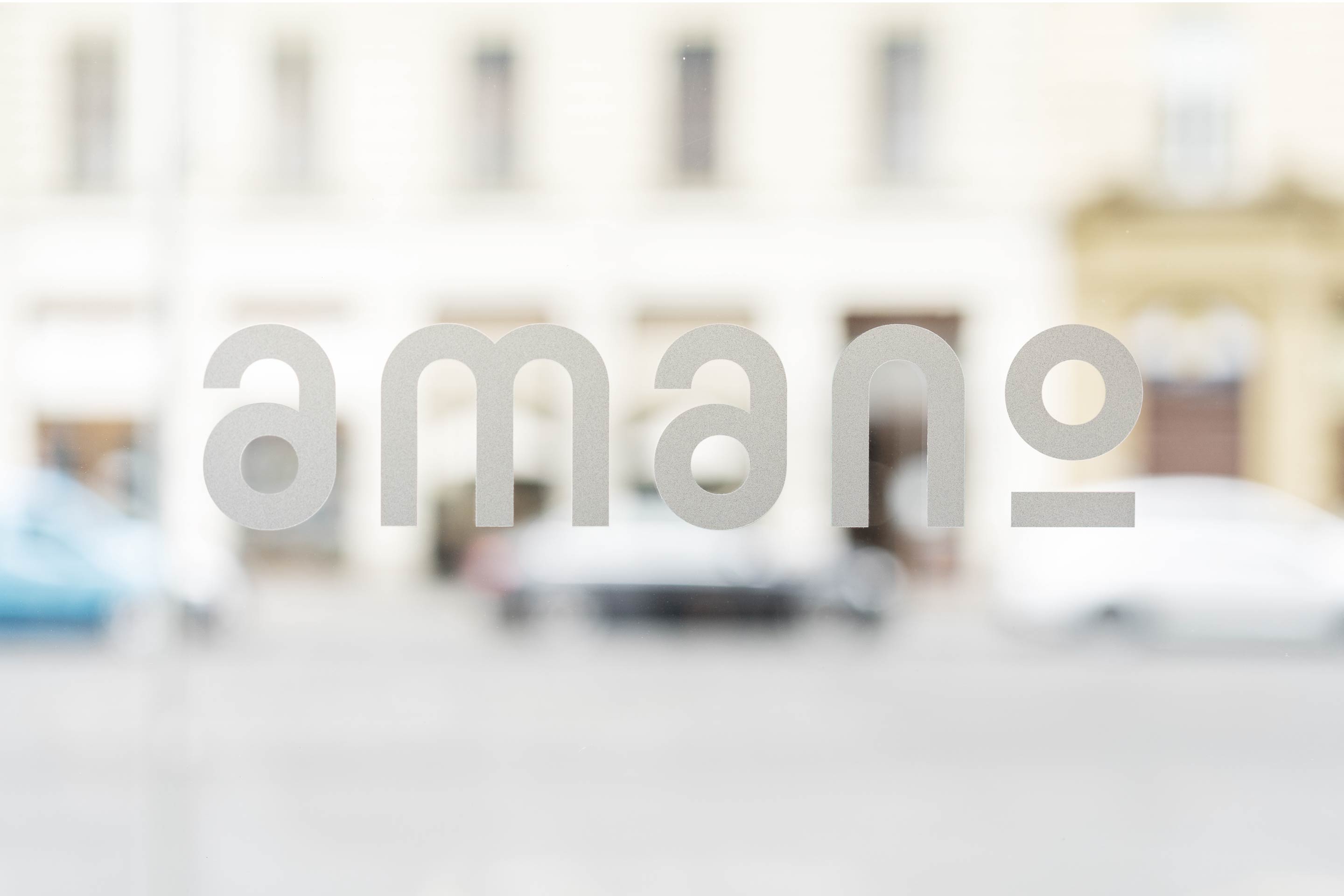
We designed the graphic identity of the Italian restaurant Amano to fit the new industrial space in the centre of Prague. A distinct combination of Sutnar grotesque and a fixed-width font accompanies the menu, business cards, seasonal offers as well as online applications. The logo can be incorporated into texts in a subtle way or lit up in the form of neon tubes.
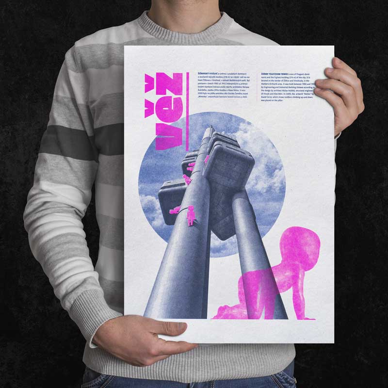
A series of five posters of Žižkov icons was created for the occasion of the neighbourhood festival Different City Experience. From the beginning, the graphics was designed for a specific reproduction in three colours using the Japanese Riso machine in our studio. It was printed with two types of screens on rough recycled paper. Each print is an original.
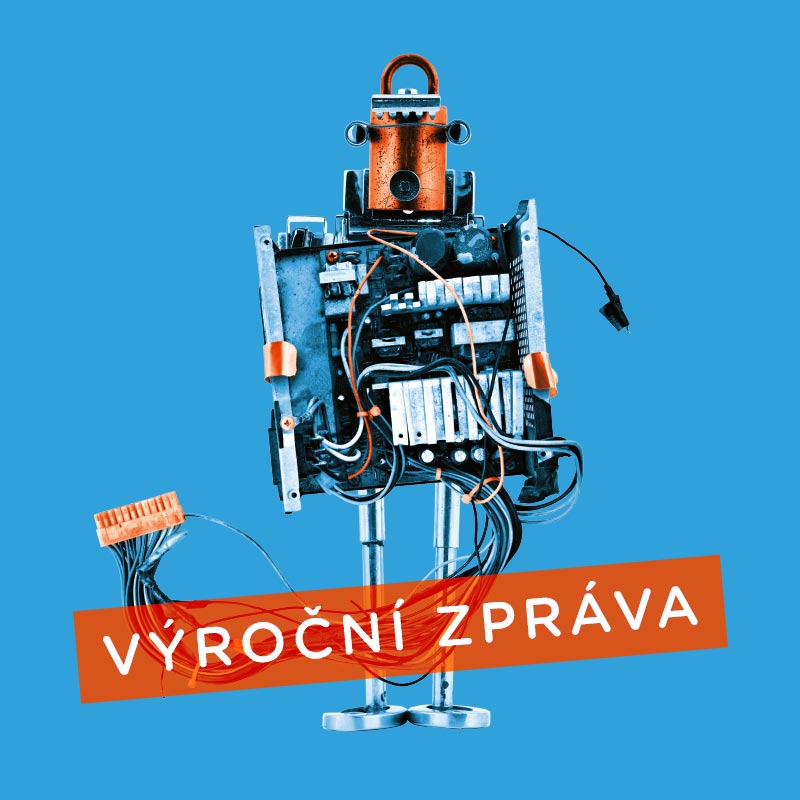
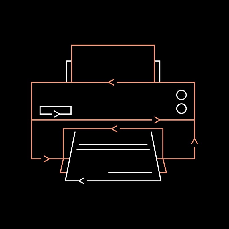
REMA’s annual report is full of shaved wires, burnt-out displays, disconnected circuits and tired motherboards. The journey of retired electronics to silicon heaven has a playful form with a lot of small details. The physical version of the report is printed on glazed recycled paper.